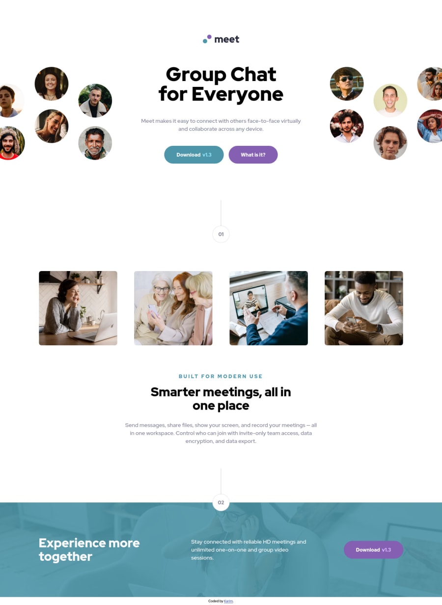
Design comparison
Solution retrospective
Hi * Front End coders, I submit another solution for this challenge.
I mainly used Angular in my projects, trying to improve my css skills using Grid & Flex and % as long as I can and also using BEM and other conventions...
Anyway, any feedback would be really appreciated it.
Thanks in advance and happy coding!
Community feedback
- @vanzasetiaPosted almost 3 years ago
Hi Karim! 👋
Congratulations on finishing this challenge! 🎉
Just to let you know that I don't know anything about Angular so I'm going to give my feedback based on your HTML code. 😅
- All the page content should live inside landmark elements (
header
,nav
,main
, andfooter
). By using them correctly, you can make users of assistive technology navigate the website easily. In this case, you can wrap all of it withmain
tag,except the attribution. The attribution should be lived inside thefooter
.
<body> <main> page content goes here... </main> <footer class="attribution"> attribution links goes here... </footer> </body>
- The
app-btn
element is not the same as the HTMLbutton
(accessible) element although those buttons should be links. But the general rule is for any elements that have:hover
or:active
states, they should be interactive elements (a
,button
, etc). - Create a custom
:focus-visible
styling to any interactive elements (button
, links,input
,textarea
). This will make the users can navigate this website using keyboard (by usingTab
key) easily. <p _ngcontent-pne-c6="" class="content__summary">BUILT FOR MODERN USE</p>
Use CSS to uppercase the text. The uppercased word in the HTML will be spelled by the screen reader (spelled letter by letter).- For any decorative images, each
img
tag should have emptyalt=""
andaria-hidden="true"
attributes to make all web assistive technologies such as screen reader ignore those images. In this case, all images are decorative only except the logo. - For the logo, you should use the
img
element. It's an important page content, so it needs to be visible to all users. Also, use the company name as the alternative text of it.
That's it! Hopefully, this is helpful! 😁
Marked as helpful1 - All the page content should live inside landmark elements (
- @ackuserPosted almost 3 years ago
It is of great worth to me!
Most of the comments, just to be honest I didn't even realise I could do these performances.
So good point, I will improve now that you told me.
Many many thanks :)
1
Please log in to post a comment
Log in with GitHubJoin our Discord community
Join thousands of Frontend Mentor community members taking the challenges, sharing resources, helping each other, and chatting about all things front-end!
Join our Discord