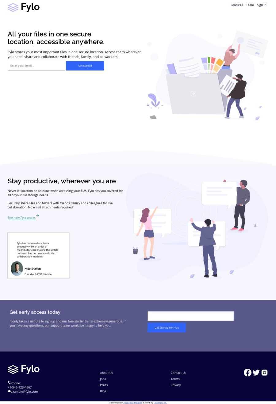
Design comparison
Solution retrospective
Hello my fellow developers, I am happy that I am able to complete and submit my third project here on Frontendmentor. This project took my time and though I had finished this project for a long time but I was very busy to submit it though I am still working on it.
The part I found challenging to me is making the curvy background especially making it responsive at all screens which I almost achieve using width:calc(98vw + 10px)
also was my first time of using this CSS function. In addition, working on the responsiveness too took me a little time.
Finally this project has strengthen my HTML and CSS skills more but this is not yet a perfect solution please kindly help me review the codes and correct anything wrong
Community feedback
- @PhoenixDev22Posted about 2 years ago
Hi Ilesanmi Emmanuel,
Congratulation on completing this frontend mentor challenge. Your solution looks great. I have some suggestions regarding your solution:
HTML
- The alternate text of the logo should not be hyphenated, it should be human readable. You may set
alt=”Fylo"
.
- It is recommended to specify the type of the form button, It’s
submit
to avoid unexpected bugs.
- Forms with proper inputs and labels are much easier for people to use. To pair the label and input, one way is an explicit label’s
for
attribute value must match its input’sid
value. Input fields without accompanying labels can lead to accessibility issues for those who rely on screen readers. If a screen reader comes across an input field without a label it will try to find some accompanying text to use as the label. (To hide the label visually but present for assistive technology, you may usesr-only
class ).
- look up a bit more about how and when to write alternate text on images. Learn the differences between decorative/meaningless images vs important content . For decorative images, you set an empty
alt
to it with anaria-hidden=”true”
to remove that element from the accessibility tree. This can improve the experience for assistive technology users by hiding purely decorative images.
- Profile images like that avatar are valuable content images, not decorative .For the alternate text of the avatar testimonial should not be ** avatar-testimonial**. You can use the avatar’s name
alt=" kyle burton"
.
- You may use like to use
<address>
tag to wrap the contact informationclass="details-section"
for the author/owner of a document or an article (email and phone number). By adding semantic tags to your document, you provide additional information about the document, which aids in communication.
- When you use the
<nav >
landmark to wrap the footer navigation , you should addaria-label=”secondary “
oraria-label=”footer”
to it . A brief description of the purpose of the navigation, omitting the term "navigation", as the screen reader will read both the role and the contents of the label. Thenav
element in the header could use anaria-label="primary"
oraria-label=”main”
attribute on it. The reason for this is that, you should add thearia-label
for a nav element if you are using the nav more than once on the page.you can read more in MDN
Instead of using a generic div to wrap the footer links in
class=”col”
, you put your links within an unordered list structure so that a screen reader will read out how many things are in the list to give visually impaired users the most information possible about the contents of the navigation.- Links must have discernible text. The social links wrapping the images must have
aria-label
orsr-only
text indicate where the link will take the user. Your images are purely decorative, you'll need to manually add an aria-hidden attribute to each of your images.<li><a href=”#” aria-label=”Visit Fylo’s facebook”
> img src="icons/facebook-fill.svg" alt="" aria-hidden=”true”></a></li>``.
- In the footer’s logo , the SVG does not contain any visible text that describes the graphic, we need to add the alternative text (invisible) by:
<title>
A short title of the SVG</title>
- Add the appropriate ID’s to the
<title>
. - It must be the first child of its parent element
On the
<svg>
tag, add aria-labelledby="uniqueTitleID”.
- You have used
<br>
, using<br>
is not only bad practice, it is problematic for people who navigate with the aid of screen reading technology. You can read more in MDN
Do not use
<br>
to create margins between elements and use theCSS margin
property .Aside these, you did great work. Hopefully this feedback helps.
Marked as helpful0@IlesanmieaPosted about 2 years ago@PhoenixDev22
Thanks for your review. I am eternally grateful.
1@PhoenixDev22Posted about 2 years ago@Ilesanmiea Glad to help. Happy coding!
Marked as helpful0 - The alternate text of the logo should not be hyphenated, it should be human readable. You may set
Please log in to post a comment
Log in with GitHubJoin our Discord community
Join thousands of Frontend Mentor community members taking the challenges, sharing resources, helping each other, and chatting about all things front-end!
Join our Discord