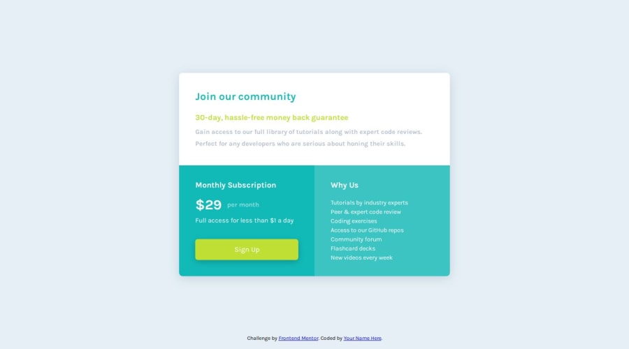
Design comparison
SolutionDesign
Solution retrospective
What are you most proud of, and what would you do differently next time?
I am proud of to use all grid and flex-box. I uploaded grid layout version as name of the project expect it, but I also add style-flexbox.css for the sake of practice.
I like concept of using flexbox for inner subelements, applying padding or other attributes to adjust size of the element, then using grid layout to structure and control of the outer frame.
Community feedback
Please log in to post a comment
Log in with GitHubJoin our Discord community
Join thousands of Frontend Mentor community members taking the challenges, sharing resources, helping each other, and chatting about all things front-end!
Join our Discord
