Submitted about 1 year ago
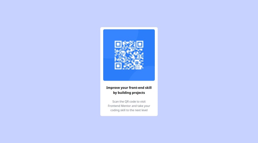
Responsive lading page using Tailwind and html
#tailwind-css
@crakensafe
Design comparison
SolutionDesign
Solution retrospective
What are you most proud of, and what would you do differently next time?
"I'm satisfied because it looks identical to the design; I could make it a bit more dynamic by making the texts and the QR code change."
What challenges did you encounter, and how did you overcome them?"Seeking to match the colors and sizes to those in Figma and encapsulating all of that in Tailwind variables to address it, I searched through the documentation."
What specific areas of your project would you like help with?"I am open to receiving criticism and contributions in all aspects, but I would like to emphasize responsive design."
Community feedback
Please log in to post a comment
Log in with GitHubJoin our Discord community
Join thousands of Frontend Mentor community members taking the challenges, sharing resources, helping each other, and chatting about all things front-end!
Join our Discord
