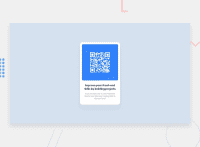
Responsive (kind of) card (flexbox, variables, animation)
Design comparison
Solution retrospective
No particular questions for now, just wanted to make sure that no critical mistakes were made in this "project". Thanks for your time!!
Community feedback
- @correlucasPosted about 2 years ago
👾Hello again Twist, congratulations for your new solution!
A great first solution Twist, I'm impressed with the level of detail you've reached here. My only tips for you is about the html structure, because the rest is really good done.
You can clean the html structure by removing some unnecessary divs, all you need is a single
<main>or<div>to keep all the content inside, and nothing more. The ideal structure is thedivand only the image, heading and paragraph. For the CSS you can reduce it by removing the class and selecting all the elements with the direct selector for each (main, h1, img and p).👾My rating for this solution: ⭐⭐⭐⭐⭐
👋 I hope this helps you and happy coding!
Marked as helpful0@TwistusPosted about 2 years ago@correlucas Thanks, that's really helpful! Sometimes I just feel the urge to give every element it's own class, just in case 😁
0
Please log in to post a comment
Log in with GitHubJoin our Discord community
Join thousands of Frontend Mentor community members taking the challenges, sharing resources, helping each other, and chatting about all things front-end!
Join our Discord

