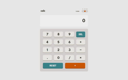
Responsive, keyboard-accessible calculator app with theme switcher

Solution retrospective
- Draggable theme switcher
- Keypad navigation via arrow keys
- Pipeline for transpiling and minifying CSS and JS
-
Making the layout work on my iPhone SE. Support for container query units is still lacking for Safari in iOS 15.8 and below. I solved this by switching to viewport units like
viand then usingcqiunits as progressive enhancement for browsers that support it. -
Building a 3-way theme switcher using the progressive enhancement approach. First radio buttons, then CSS animations, add minimal JS to apply the theme, and finally allow the handle to be dragged. Learned a lot about pointer events and dragging!
-
Applying CSS grid layout to the
tableelement. I solved this by applyingdisplay: contentsto thetbody,tr, andtdelements so that the button keys can participate directly in thetable's CSS grid layout.
I haven't spent a lot of time on improving the screen reader accessibility, so if you spot any room for improvement, I'd love to hear it!
Please log in to post a comment
Log in with GitHubCommunity feedback
No feedback yet. Be the first to give feedback on Josh Javier's solution.
Join our Discord community
Join thousands of Frontend Mentor community members taking the challenges, sharing resources, helping each other, and chatting about all things front-end!
Join our Discord