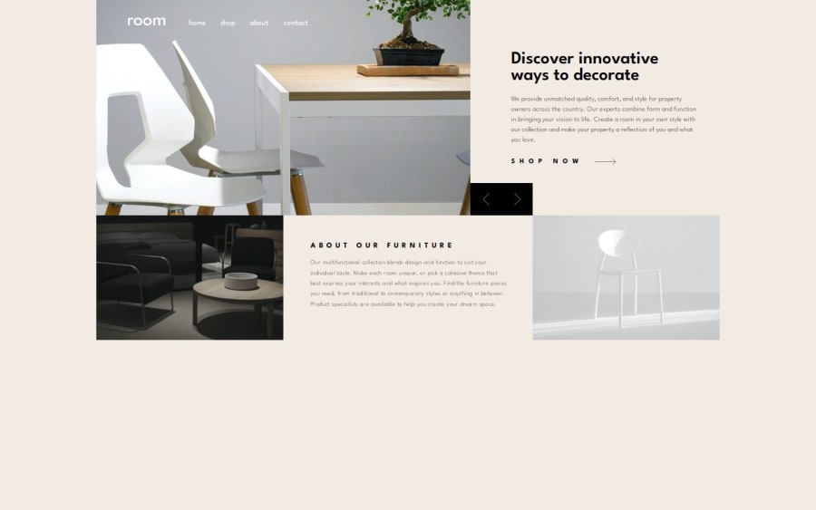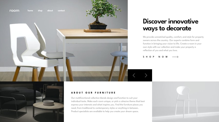
Design comparison
SolutionDesign
Solution retrospective
What are you most proud of, and what would you do differently next time?
I'm feeling fluent in grid, and creating image and text transitions. The mobile menu turned out better than my previous efforts.
What challenges did you encounter, and how did you overcome them?I had to do some digging to set an event listener on the window resize but I think I got that down well. I would have liked to do an image carousel/slider instead of fade transitions but I'll plan to do that in a future project.
What specific areas of your project would you like help with?A11y semantics.
Join our Discord community
Join thousands of Frontend Mentor community members taking the challenges, sharing resources, helping each other, and chatting about all things front-end!
Join our Discord
