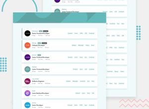
Responsive Job Filtering App w/ Sveltekit, Tailwindcss, Typescript
Design comparison
Solution retrospective
Hello everyone.
Feel free to share any advice on my design/code.
Thank you for your time.
Have a nice day/night. Peace
Community feedback
- @MaxTarasevichPosted over 2 years ago
Hello! Great job! It seems to me that the duration of the hover effect is too short to perceive, I usually set it to 300-400. By the way, tailwind has great built-in animations, for example: https://tailwindcss.com/docs/animation#bounce The background on the cross icon in the filter does not change on hover as on the layout. I also think it’s worth setting a flex-wrap on the filter container so that the Clear button is at the bottom with a large number of filters and a small screen size. All this is purely my subjective opinion! I hope my comment was helpful!
Marked as helpful1@mattari97Posted over 2 years ago@MaxTarasevich Actualy you are right i forgot the hover effect on the remove btn.
I also think the wrapping is a good idea and not a problem since the filter bar is hidden in the screenshot 😜
As you made me go back to the code i also added a check on the addFliter method if is it already in the filters Array. I also disable the tag in the jobs cards so you don't try to do t anyway.
Nice review !
Thank you bud
0
Please log in to post a comment
Log in with GitHubJoin our Discord community
Join thousands of Frontend Mentor community members taking the challenges, sharing resources, helping each other, and chatting about all things front-end!
Join our Discord
