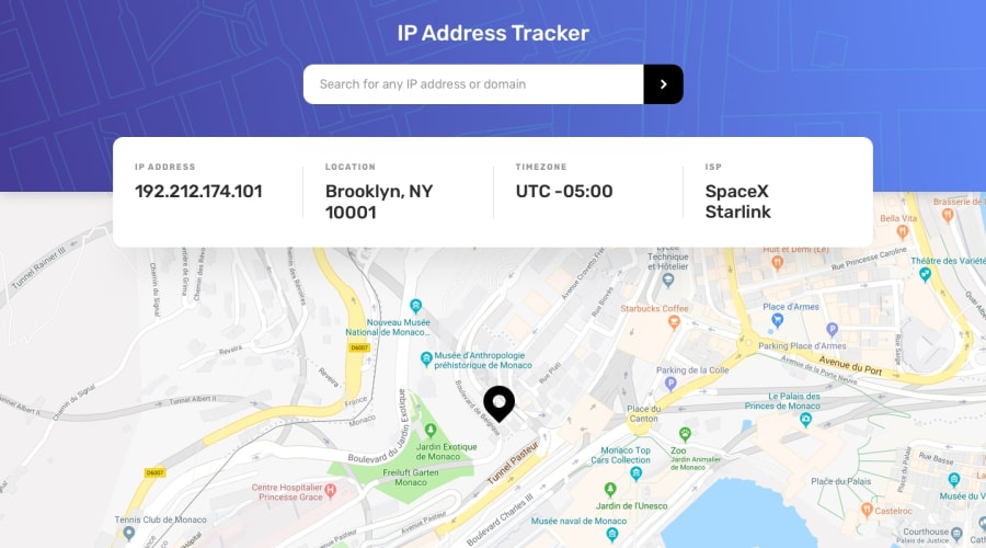
Design comparison
SolutionDesign
Solution retrospective
In what areas can i improve this app
Community feedback
- @jkellermanPosted over 2 years ago
Well done! Really good. Just a few things: 1.) Look at accessibility issues 2.) When you hover over the search button you can see the input field behind the button 3.) You've misspelled search in the placeholder
0
Please log in to post a comment
Log in with GitHubJoin our Discord community
Join thousands of Frontend Mentor community members taking the challenges, sharing resources, helping each other, and chatting about all things front-end!
Join our Discord
