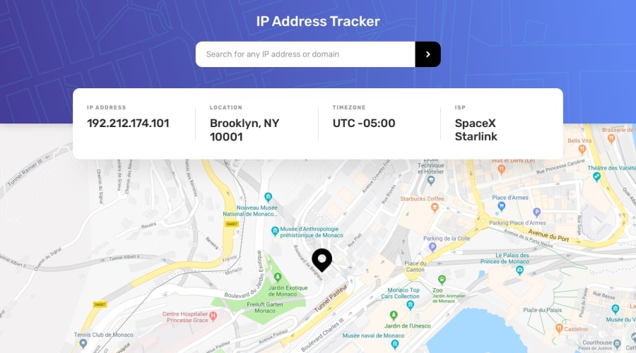
Design comparison
Solution retrospective
Hey, first time using an API and a JS library. The feedback is more than welcome. I hope you enjoy the result.
Community feedback
- @BurritoDoggiePosted over 3 years ago
hello puwii,
I am so happy! I was able to see what street I live on! I am happy to see the great effort that you put into this project! There is one thing however that I think you could work on. As I was inspecting I found out that people with small screens (like phones or tablets) don't get any border radius on the right side of the little box that tells the information of your ip address,location,etc etc, but there is border radius on the left side of the box.So it probable won't be so hard to fix it.Great work!
Keep Coding!
(@@) \__/2@puwiiiPosted over 3 years agoHi BurritoDoggle, thanks for your comment!
I'm aware of that, it's because that box has an "overflow-y: scroll" on mobile resolutions, so you can scroll down on your phone without having to fit the content increasing the height, but if you rescale the page in PC, the browser put the scroll bar to that box automatically. I made this project like in a day so I can move into another project. I don't know if there is a way to fix that scroll bar on PC browsers but I will search for it. Again thank you a lot <3.
PD: Sorry for my English, I'm not using a translator, I want to learn correctly XD
1@BurritoDoggiePosted over 3 years ago@puwiii Hey,I am happy I could help ! I am so surprised that you did all of that good work in just one day. I would love to see more of it. Keep posting new challenges for me to see!
Keep Coding!
                             (@@)
                              \__/
0
Please log in to post a comment
Log in with GitHubJoin our Discord community
Join thousands of Frontend Mentor community members taking the challenges, sharing resources, helping each other, and chatting about all things front-end!
Join our Discord
