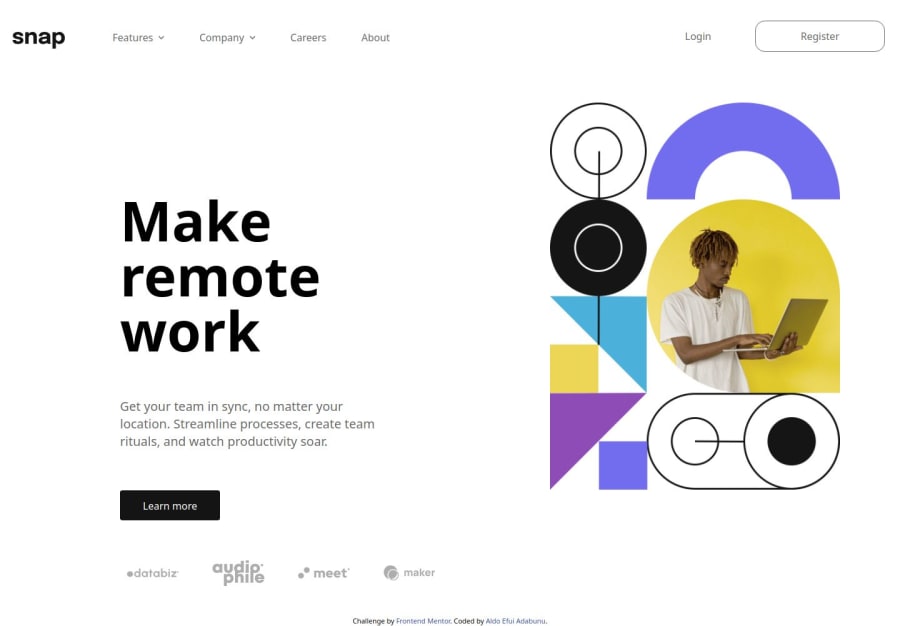
Responsive intro-section made with tailwindcss and javascript
Design comparison
Solution retrospective
I learned a lot about javascript with this project, especially with the drop down menus. There is still a lot I need to polish with this project and I would love some feedback on what to improve on and how to add the shadow overlay without breaking the side nav menu in mobile view.
What specific areas of your project would you like help with?How to make the menus open one at a time, and have them close if anywhere on the page but the menu element itself is clicked on. I would also love to know how to get the shadow overlay when the side menu opens to work without it breaking the page, if you look at my solution I already attempted it with an empty div but that seems to break the code, any solution on how to go about that is welcome.
Community feedback
- @grace-snowPosted 7 months ago
I'm afraid this overflows my mobile screen a lot and behaves strangely when the mobile menu is open because I can still scroll. I'm away from a computer but I expect there may be problems at other screen sizes too.
Before that though, I'll go through the html and list out some necessary changes & recommended improvements as those are the most important to start with...
- The mobile menu (hamburger) menu button must be the first element inside the nav. This is so that assistive tech users can find it easily.
- That same button must have an aria-expanded attribute, whose boolean value will toggle between false and true on click (thus communicating the state of the disclosure to assistive tech, if its expanded or collapsed). This is necessary on all buttons that trigger a disclosure so is needed on all of these "dropdown" triggers within the nav. They are not anchors. I've written up a full post about disclosure UI code and recommend you read it.
- Additionally, I recommend the hamburger open/close buttons are just one button. You can change which icon is visible within the button based on its aria-expanded state (true/false).
- The hamburger menu button must have an accessible name. Currently you are using the image alt for that, which is OK but it would need to say "navigation toggle" instead of "hamburger menu" and "close menu icon". Alternatively you could leave alt blank on those icon images and use aria-label on the button instead, or visually-hidden label text inside the button. The way you choose to solve it is your choice from those options.
- "Register" should be an anchor not a button. Same with "learn more".
- The paragraph underneath the h1 is definitely not an article. Make sure you understand what that landmark is for.
- The company logos are important content, not decorative in my opinion. You have to ask - are they included for a reason? It's to show clients. That's valuable information for people to know about a brand/service so must not be hidden from assistive tech users.
- I also think you are misusing the section element. This doesn't particularly matter as sections only have meaning when they are labelled. But as a general rule think of a section as a significant chunk of content that always has a heading, usually a h2). It should not be used as a generic wrapper for an image just to make a layout work. That's what a div is for.
- Try to make sure all content is contained within landmarks. That means the attribution should be in a footer.
- If links ever open in a new tab, make sure they include some visually-hidden text (eg in a span) that communicates that behaviour eg "(opens in a new tab)"
- Don't have empty divs in the html for no reason. I see one at the end of the nav for example.
Marked as helpful1@grace-snowPosted 7 months agoIn the styling I think the issues stem from
- using width 100vw. That is actually telling an element to be wider than the screen because viewport units don't account for scrollbar width. So by using
w-screen
you are actually causing unwanted horizontal scroll bugs straight away whenever a scrollbar is present. - when the mobile menu is open it either needs to be full height or it needs to prevent scroll. At the moment it's like it "ends" as I scroll down, making it look broken.
- it's hard to tell when I'm viewing code on mobile and not inspecting in browser... But it looks like you may be over using or over-nesting flexbox. That may be fine but it rings alarm bells so is something I'd want to check. Really, we only want to use flex or grid when they are necessary, and we should try to keep html and css as simple as we can.
- maybe it's in the design, I'm not sure. But generally it is terrible to change font weights on hover or active. That can cause layout shift which is very bad for performance and creates a poor user experience.
- try to avoid using width so much. Lean towards max width in rem instead. Using width can make you lose control of the layout when in % or worse make a site inaccessible for users who need a different text size.
- similar, try to avoid large or explicit margins. If using flexbox make use of the gap property and other properties like justify, alignment, grow, shrink and basis.
- the list items in the nav definitely should not have widths. This would break as soon as authors change the content or users translate the page or change font-related settings.
- make sure you understand the difference between padding and margin
Overall you may benefit from reading the post about responsiveness and media queries too, which is on the same FEDmentor.dev site. It covers some of this width and height stuff I'm referring to
Marked as helpful1@KwakuAldoPosted 7 months ago@grace-snow I am going to work immediately on the challenge with these recommendations. Thank you very much!
0@grace-snowPosted 7 months ago@KwakuAldo sorry I ran out of time to look at the JS. But one more thing to note RE the mobile menu - add an escape key listener when the menu is open so the mobile menu closes on press of escape. And remove that listener when the mobile menu is closed / it's larger screen
1@KwakuAldoPosted 7 months ago@grace-snow thanks a lot, I believe I have made all the changes you recommended, when you have some time please go through the code once more and let me know what you think.
0@grace-snowPosted 7 months ago@KwakuAldo
- There's still a
width: 100vw;
causing unwanted horizontal scroll on larger screens. - The layout breaks at mid-sized screens. Have dev tools open on the side and resize the viewport often (including zooming in/out regularly as well)
- The desktop layout looks all misaligned too, expecially in the header.
- There appears to be a grey background on only part of the UI like only on the nav, whereas the design looks like this is on the body.
- All of the dropdown links are missing the aria-expanded attribute
- The down arrows still have alt descriptions when they should be blank.
- Careers and About are buttons when they should be anchors
- Login and Register and Learn More have all been set to open in a new tab when they shouldn't. (they would be part of this site)
- i am still able to move focus to other parts of the page when the mobile menu is open, meaning it scrolls down and the close button becomes hidden. When a sidebar like this is open it should either trap focus inside it by making the rest of the page inert or it should close as soon as focus exits the panel.
- On larger screens when I open a dropdown, the list of links overlaps the triggering button when it shouldn't meaning that the focused element is hidden. The dropdown must appear below the button that triggered it.
- When one dropdown is open then I click on another, the new one I've clicked on should open. At the moment, the previous one closes but the new one doesn't open until I click again.
- The logo images are valuable content but still have no alt.
- When the menu is open, there is no dark overlay on the rest of the page like is shown in the design. This is usually done with a pseudo element on the body.
Marked as helpful0
Please log in to post a comment
Log in with GitHubJoin our Discord community
Join thousands of Frontend Mentor community members taking the challenges, sharing resources, helping each other, and chatting about all things front-end!
Join our Discord