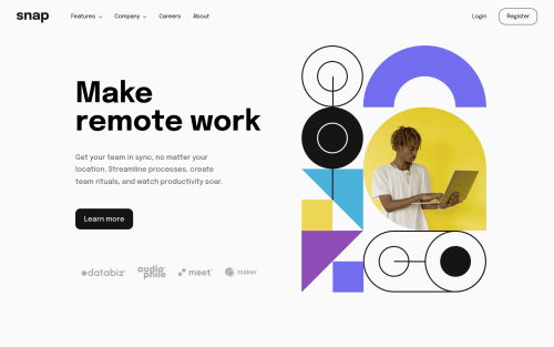
Responsive Intro section with dropdown navigation
Design comparison
Solution retrospective
Hello π. It is my first project where I have added a dropdown. I will be happy to receive your valuable feedback. π₯°
What media query breakpoint do you use for mobile & desktop?
Community feedback
- @elaineleungPosted over 2 years ago
Hi Prantik, great work on this challenge! It looks pretty much like the design, and the dropdowns look nice. One thing I struggled with a bit was, when I was trying point my mouse at the dropdown nav in the side bar, the position of the nav items change because my mouse is no longer hovering on the dropdown, and then I'd have to try to position my mouse again. I think it's that's a tricky thing about using hover in a sidebar since there's a chance that something else gets hovered over since it's all in the same column. Maybe you can try adding an animation delay, or maybe try a click even instead for the sidebar. Another suggestion I have is, try to change the line-height of your title to something smaller in the desktop version, as the lines look quite spaced out right now.
Also, to answer other your question, I used a breakpoint of 960px for my challenge π
Once again, great work!
Marked as helpful0@prantiknoorPosted over 2 years ago@elaineleung Thanks for your valuable feedback.β¨
-
I added both
hover
&click
events for dropdown. You can see the dropdown by hovering or clicking. As the sidebar is mostly for mobile users, they can't hover. So I didn't remove thehover
effect on the mobile view. -
I wanted to add animation on the dropdown but I forgot.π€
-
I think the title's
font- size
is quite similar. theline-height
will be smaller.
Again thanks for the feedback.
Prantik
1@elaineleungPosted over 2 years ago@prantiknoor Oh yes, clearly I have overlooked the fact that there is no hovering for mobile usersπ , so thanks for pointing that out. In that case, wouldn't it makes even more sense to have your hover rule moved to the media query? But I can also understand it if you want to keep it for users using a mouse on a small screen. This time I tested the site on my phone, and there were a few times where the dropdown didn't open on the first try, but I think it has more to do with the spacing between the items, so maybe you can consider widening the space. When I worked on this, I didn't understand at first why the gaps between the mobile links in the design were so wide, but now I fully understand!
0 -
Please log in to post a comment
Log in with GitHubJoin our Discord community
Join thousands of Frontend Mentor community members taking the challenges, sharing resources, helping each other, and chatting about all things front-end!
Join our Discord