Submitted about 2 years ago
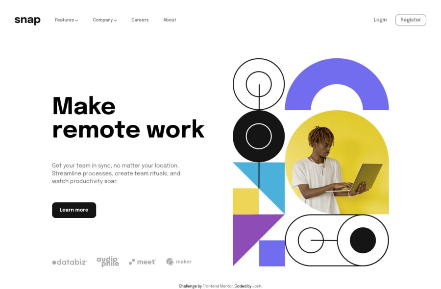
Responsive Intro section with dropdown navigation
#sass/scss
@Ao-chi
Design comparison
SolutionDesign
Solution retrospective
Yahallo!
Second project done! And I think I finished it much faster compared to the first one maybe because some design concepts are pretty much the same. In terms of challenge, I find it enjoyable building the dropdown menus. Also I find it difficult to resize an svg image. I resort in using <img> element instead.
Was thinking of adding light/dark theme but I hesitated. Maybe I'll add it next time.
If there's anything you'd like to add or suggest feel free to comment! Thanks in advance~
Community feedback
Please log in to post a comment
Log in with GitHubJoin our Discord community
Join thousands of Frontend Mentor community members taking the challenges, sharing resources, helping each other, and chatting about all things front-end!
Join our Discord
