Design comparison
Solution retrospective
Hey!
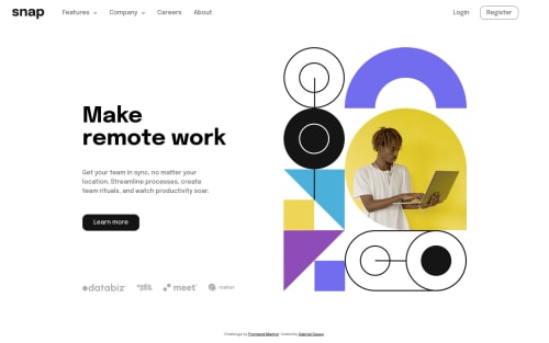
This is my solution to the intro section with dropdown menu challenge.
I made it with vanilla js this time, so I wouldn't get rusty!
Any feedback will be much appreciated :)
Community feedback
- @sulemaan7070Posted over 1 year ago
hey Gabriel Gusso😄, great job here are a few tips for you.
1.I see that you have applied only the
desktop-image
on both the desktop and the mobile versions.. you will find theimage-hero-mobile
in theimages
folder.. you can responsively change the image based on themedia-query
..2.You can use
picture
element here which helps you to switch between the images based on the media-query.. more about picture element here📚3.Increase the font-size for the h1 on the desktop version to match the design..
hope that helps, happy coding💯🔥👍🏻
Marked as helpful1@g-pgPosted over 1 year agoHey @sulemaan7070 !
I actually changed the image with JS, but I didn't know I could use the <picture> tag for this. Thanks!
I struggled a little bit to find the right width on this one without the Figma file. Is 1440px really the desktop width of all challenges?
1@sulemaan7070Posted over 1 year ago@g-pg not necessarily... sometimes you would want to show the desktop version on the tablet also in that cases you might need less than 1440px.. try and select what is best for you
Marked as helpful1
Please log in to post a comment
Log in with GitHubJoin our Discord community
Join thousands of Frontend Mentor community members taking the challenges, sharing resources, helping each other, and chatting about all things front-end!
Join our Discord