Submitted almost 4 years ago
Responsive intro component workflow mobile first using flexbox

@Lenugo
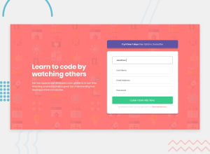
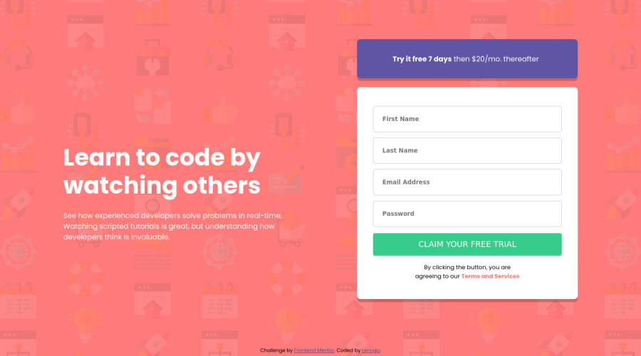
Design comparison
SolutionDesign

Solution retrospective
I would like received feedback from my work to improve more and more
Community feedback
- @grace-snowPosted almost 4 years ago
Hi
On mobile content is wider than my screen. I think the button looks different on the design too
Marked as helpful1 - P@palgrammingPosted almost 4 years ago
you should move your error messages under each input field and not group them together so it is easier for the user to see the message for each input
Marked as helpful0 - @grace-snowPosted almost 4 years ago
Hi
On mobile content is wider than my screen. I think the button looks different on the design too
1


Please log in to post a comment
Log in with GitHubJoin our Discord community
Join thousands of Frontend Mentor community members taking the challenges, sharing resources, helping each other, and chatting about all things front-end!
Join our Discord