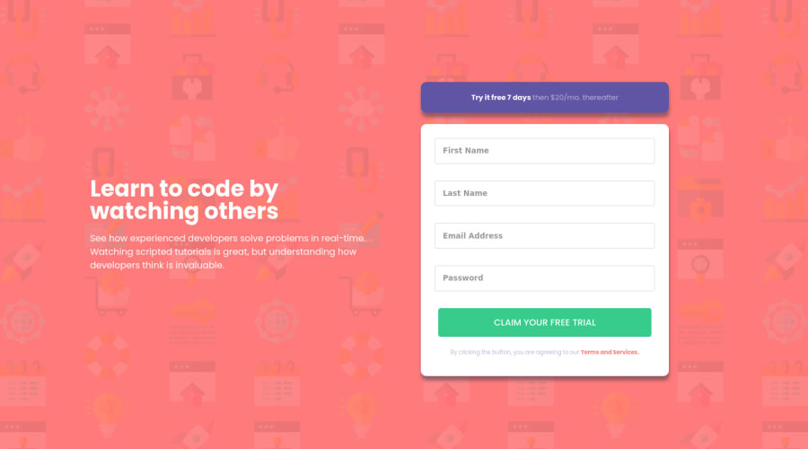
Design comparison
Solution retrospective
Hello~! (●ˇ∀ˇ●)
This project further helps me understand about JS and forms, which is really awesome! But JS still confuses me, so if you have any tips please let me know!
Please do check this one out! If you have any feedback or suggestions, please do let me know! Thank you so much.
Community feedback
- @arbaivPosted about 3 years ago
Hi, there👋. Clean project, nice work with the JS.
Once you submit the form with the input fields empty, it shows an error as expected 👍. Then when you enter text into the input field and focus out from it, the error message still shows. And it doesn't go away until you hit the submit button again. It's okay, not a big deal, but it's not good for the UX.
You can improve that by adding a blur event to the input element that will check: if the input value is available then remove the error message.
Marked as helpful1P@BriuwuPosted about 3 years ago@arbaiv Thank you! I didn't know about the blur event, thanks for the tip! (≧▽≦)
0 - @PhoenixDev22Posted about 3 years ago
Hello @Briuwu7474,
Well done on this challenge. Your solution looks great . I just notice the border of the inputs isn’t rounded on the focus . I hope this feedback helps , Happy coding1 - @johanglyPosted about 3 years ago
its so cool, do you want to study with me? i need a partner xd
1
Please log in to post a comment
Log in with GitHubJoin our Discord community
Join thousands of Frontend Mentor community members taking the challenges, sharing resources, helping each other, and chatting about all things front-end!
Join our Discord
