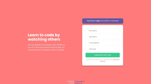
Responsive Intro component with Sign up form using HTML, CSS and JS

Solution retrospective
I designed the layout easily by using CSS flexbox. Even though the input validation part took me some time to figure out I managed to finally create a real simple function which does several validation tasks at once. I am so much grateful for the algorithm scripting course I took, and I will put those lessons at use a lot from now on. Also, one mistake that I had in previous challenges was not using line height which caused the text lines a bit difficult to read but I managed to fix this issue and I used the line height property perfectly in this challenge and I really appreciate the difference it made.
What challenges did you encounter, and how did you overcome them?The form validation took me quite some time to figure out, but I managed to solve and create an easy function which does all the job at once. I am so much grateful for courses like freecodecamp which taught me how I should think through different algorithms and figure out a way to solve it.
What specific areas of your project would you like help with?The style guide should contain a bit more detail about the layout's design and a bit more guide or a way to think through the functions would be a lot helpful especially for newbie developers.
Please log in to post a comment
Log in with GitHubCommunity feedback
No feedback yet. Be the first to give feedback on Shoaib Shuja's solution.
Join our Discord community
Join thousands of Frontend Mentor community members taking the challenges, sharing resources, helping each other, and chatting about all things front-end!
Join our Discord