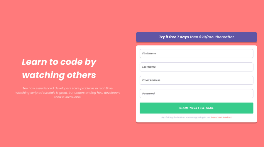
Design comparison
Solution retrospective
I couldn't style the error icon and message properly and for some reason also I couldn't style the text under the big heading for desktop :(
Community feedback
- @cr1deg0Posted over 2 years ago
Hi Hassan
The error icon is an svg, rather than inserting it as an image in the html document you can try by adding a css class via javascript to the input element when validating the form. You can define error.svg as background image in the class and control the size and position within the input element with the background properties.
The background images are failing to display because are missing quotes in the code: background-image: url("image.png");
I've noticed also that you have imported the fonts in Italic, perhaps this is what it's preventing the styling of the heading and text.
I hope it helps!
0
Please log in to post a comment
Log in with GitHubJoin our Discord community
Join thousands of Frontend Mentor community members taking the challenges, sharing resources, helping each other, and chatting about all things front-end!
Join our Discord
