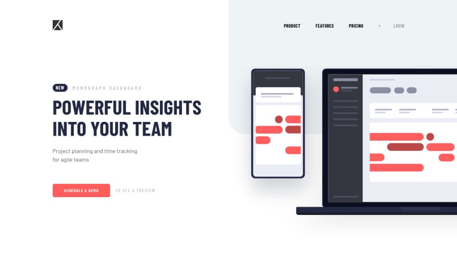
Responsive intro component with collapsible navbar
Design comparison
Solution retrospective
Hello! 👋
Another great challenge! However, I did not find this one to be as intriguing as the others I've done—perhaps I prefer developing singular components instead of full pages 😬
But I'm determined to do more, if only to overcome this prejudice 🤣
Most of the stuff in this challenge was something I have now gotten used to, but the collapsible navbar was slightly tricky. I was able to successfully make it, however! 😁
Please do go through my solution and leave some feedback!
I was thinking of completing some challenges with React (something I've never done yet) so that I could learn and practice it, can you guys link a few challenges which may require 'the React mindset'? Would really appreciate it!
Community feedback
- @ApplePieGiraffePosted almost 4 years ago
Hi, Syed Ali Mansoor! 👋
Nice to see you complete another challenge! 😀 I'm still really liking that attribution every time I see it and I think you've done a good job on the rest of this challenge! 🙌 And, haha, sometimes working on small components is just nice because it's easier to think about and work on everything! 😅
You should definitely give React a shot because that will allow you to separate your apps into smaller components that you can isolate and think about them on their own. 👍 I think most challenges here would work well with React but a few suggestions (off the top of my head) might be the Bookmark landing page (since it has a few reusable components and some JS stuff to have fun with) or the Jobs listings with filtering (for the same reasons, mostly). 😉
Keep coding (and happy coding, too)! 😁
1@syedalimansoorPosted almost 4 years ago@ApplePieGiraffe Thanks for the appreciation on the challenge and the footer! Makes me really happy. 😁
Also thanks for the suggestions. I will try out these challenges next!
Happy coding to you too!
0 - P@palgrammingPosted almost 4 years ago
Everything looks really good but you might want to check the text "to see a preview" on the bottom of the page and how it is wrapping in the mobile view but everything else looks really good. Nice Job!!!
1@syedalimansoorPosted almost 4 years ago@palgramming Thank you so much, I really appreciate the feedback!
0
Please log in to post a comment
Log in with GitHubJoin our Discord community
Join thousands of Frontend Mentor community members taking the challenges, sharing resources, helping each other, and chatting about all things front-end!
Join our Discord
