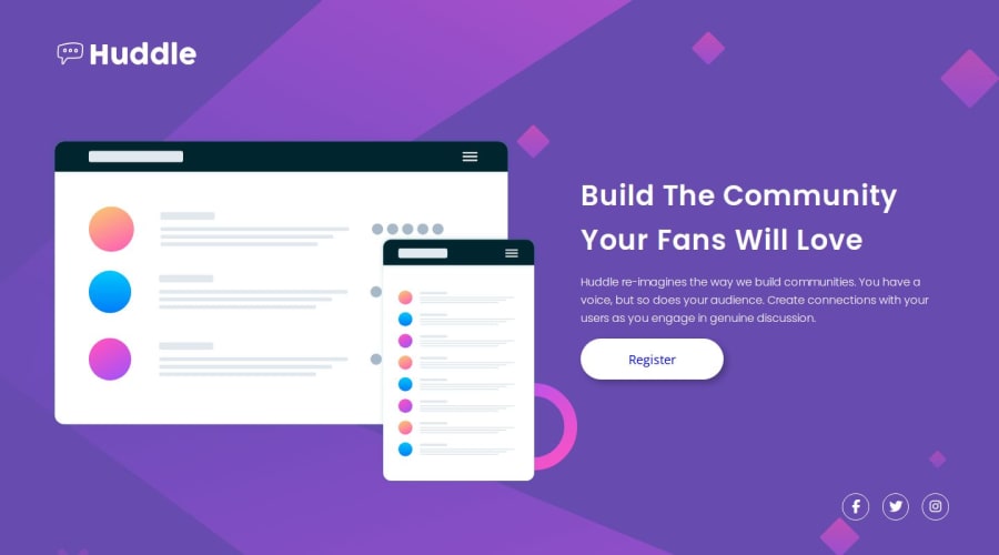
Design comparison
Solution retrospective
Hello FrontendMentor!
I completed my last (for now) newbie challenge where I played with a lot of dynamic css units to reach my goal, that I only use media queries for layout changes.
I hope, I didn't violate (too much) web design paradigms. Any suggestion on my errors and mistakes are welcome!
What specific areas of your project would you like help with?I still struggle whether to use margins or flex/grid gap properties to align the elements. I did not find proper rule of thumb for it. If you can give me an advice on how to determine it, I would appriciate it very much
Community feedback
- @truong231298Posted about 1 year ago
@kemenyfa-szu you have great work fof this challenge, and i 'm so happy for finishing newbie challenge. besides, i have the same problem with you in struggle whether to use margins or flex/grid gap properties to align the elements. Well i think we can fix it if we have more practive. See you late
1
Please log in to post a comment
Log in with GitHubJoin our Discord community
Join thousands of Frontend Mentor community members taking the challenges, sharing resources, helping each other, and chatting about all things front-end!
Join our Discord
