Submitted 7 months ago
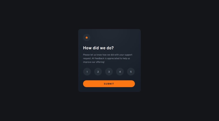
Responsive Interactive rating component using BEM, SCSS, Flexbox & BEM
#sass/scss#bem
P
@DalaScript
Design comparison
SolutionDesign
Solution retrospective
What are you most proud of, and what would you do differently next time?
- Nothing special this time. It was a simple project but still a great learning experience! ✨💻
- I wouldn’t call it an obstacle, but the radio-type inputs took the most time to style properly. 🎨📻
- Any advice from other developers would be appreciated! 🙏💡
Community feedback
- @LesSylPosted 6 months ago
Hi, your solution is really good!
For your next project try using em and rem instead of px, for example padding and margin. You can read more about this topic here:CSS units and CSS values and units.
Good luck!
0
Please log in to post a comment
Log in with GitHubJoin our Discord community
Join thousands of Frontend Mentor community members taking the challenges, sharing resources, helping each other, and chatting about all things front-end!
Join our Discord
