Design comparison
Solution retrospective
Hello,
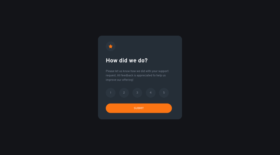
I completed my first JS project. While building this project, I found it difficult to style the buttons and rating paragraph after the submit button is clicked.
Any suggestion on how to improve this or my code will be appreciated. Thank you.
Community feedback
- @CodingTimmyethPosted almost 2 years ago
Hey! I had the same issue with the background color for the icon and the numbers. The way I figured it out was by using the $darkBlue variable and changing the last percentage to 21% and it worked pretty well for me!
Marked as helpful1 - @VCaramesPosted almost 2 years ago
Hey there! 👋 Here is some feedback to further improve your code:
- This LINK is not necessary ❌.
- The “icons/illustrations” in this component are purely decorative. ⚠️ Their
alt tag
should be left blank to hide them from assistive technology.
More Info:📚
https://www.w3.org/WAI/tutorials/images/
- The HTML for the ratings needs to be rewritten as it was done incorrectly ❌:
To ensure that the "rating buttons" are fully accessible 💯, they need to be built using a
form
⚠️.- Everything will be wrapped inside a
fieldset
which will have alegend
that is visually hidden using CSS. - Inside, there should be five
input radios
and eachinput
should have alabel
attached to it to make the “ratings” accessible. - The last thing you will want to include will be a
button
so users can submit their choice.
Here is how it looks like fully implemented: EXAMPLE
More Info: 📚
- Once the top is implemented , for your JS, the
eventListener
should be on theform
⚠️ as asubmit
.
More Info:📚
Click vs. Submit EventListeners
If you have any questions or need further clarification, you can always check out my submission and/or feel free to reach out to me.
Happy Coding! 😈
Marked as helpful1@mayor-creatorPosted almost 2 years ago@vcarames Thank you for the informative feedback. Can you please explain why using the button element for the rating in the HTML was incorrect?
0@VCaramesPosted almost 2 years ago@mayor-creator
buttons
are for single actions; submitting a form, adding to cart, etc...radios
are for selecting a single option from a group... like this challenge requires you too.Marked as helpful1
Please log in to post a comment
Log in with GitHubJoin our Discord community
Join thousands of Frontend Mentor community members taking the challenges, sharing resources, helping each other, and chatting about all things front-end!
Join our Discord