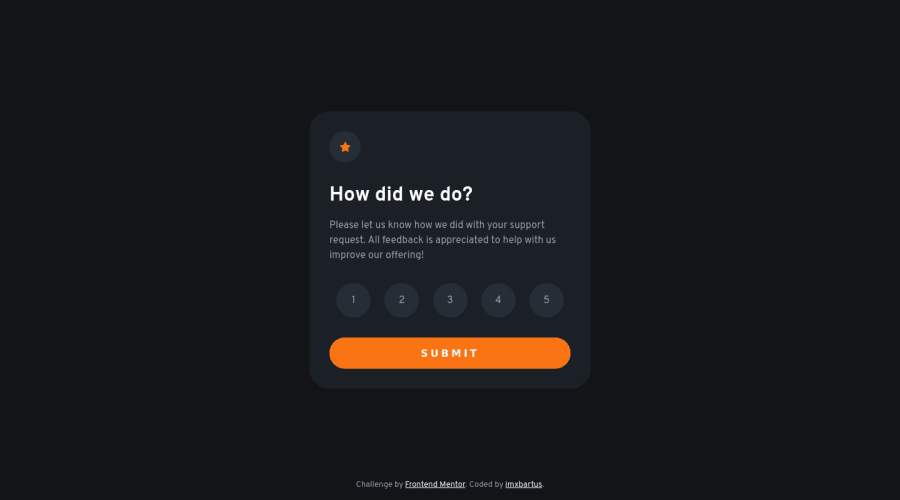
Design comparison
Solution retrospective
tell me what yo think. Have a nice day 😌
Community feedback
- @shashreesamuelPosted about 3 years ago
Hey good job completing this challenge
Keep up the good work
Your solution looks great however I think that the button text does not need to have letter spacing as seen in the design.
In terms of accessibility issues simply wrap all the content between main tags
I hope this helps
Cheers Happy coding 👍
Marked as helpful0 - @sparrowslPosted about 3 years ago
Wow, awesome job, I have a question after I read the JS code on github.
can you explain line 10 to 14 that contains this code: ratings.forEach(rate => rate.classList.remove('selected'))
It looks redundant for looping over the rating array inside each rate. Maybe it could work if you bring it outside.
let me know your thoughts on this.
0@imxbartusPosted about 3 years ago@benjithorpe Hi, I did it to first of all remove the class of every element, then I add the 'selected' class to the clicked element. It didn't work in my case when I didn't put it in for each loop.
0@sparrowslPosted about 3 years ago@imxbartus ok cool. now I understand. Thanks for taking your time to explain it
0
Please log in to post a comment
Log in with GitHubJoin our Discord community
Join thousands of Frontend Mentor community members taking the challenges, sharing resources, helping each other, and chatting about all things front-end!
Join our Discord
