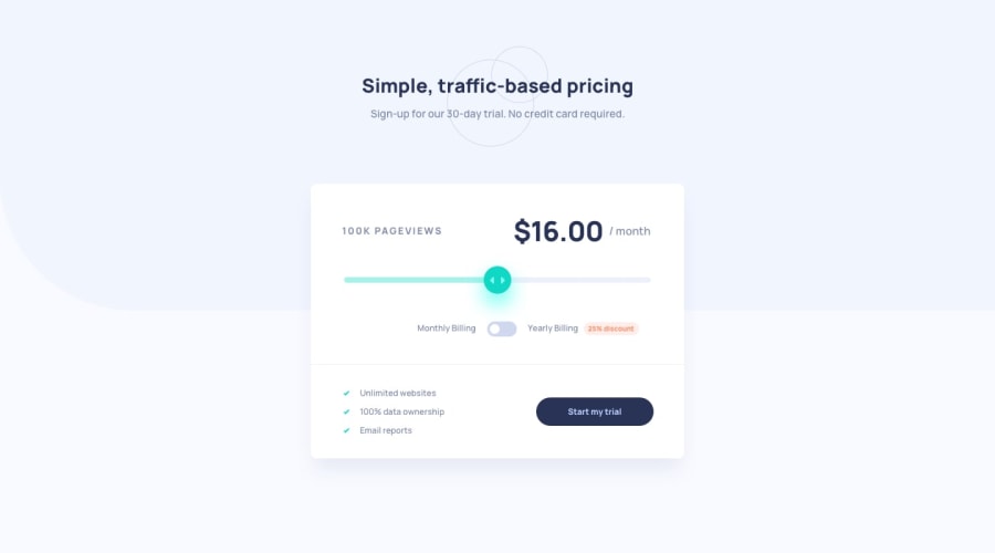
Submitted about 2 years ago
Responsive Interactive Pricing Component
@VishwajeetBarve
Design comparison
SolutionDesign
Solution retrospective
In this project, I learned in-depth about the inputs and how much pain it is sometimes to style them, but it was a good experience. I also tried to use the BEM naming convention as much as I can (I know it is not perfect yet.) because it makes the code more readable to other users and also structured the CSS in a better way.
Any suggestions/tips are appreciated.✌
Community feedback
Please log in to post a comment
Log in with GitHubJoin our Discord community
Join thousands of Frontend Mentor community members taking the challenges, sharing resources, helping each other, and chatting about all things front-end!
Join our Discord
