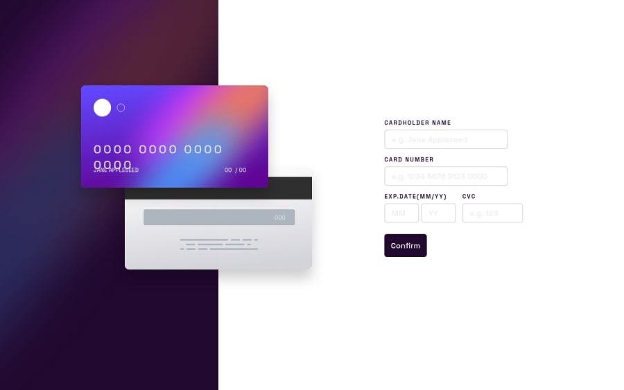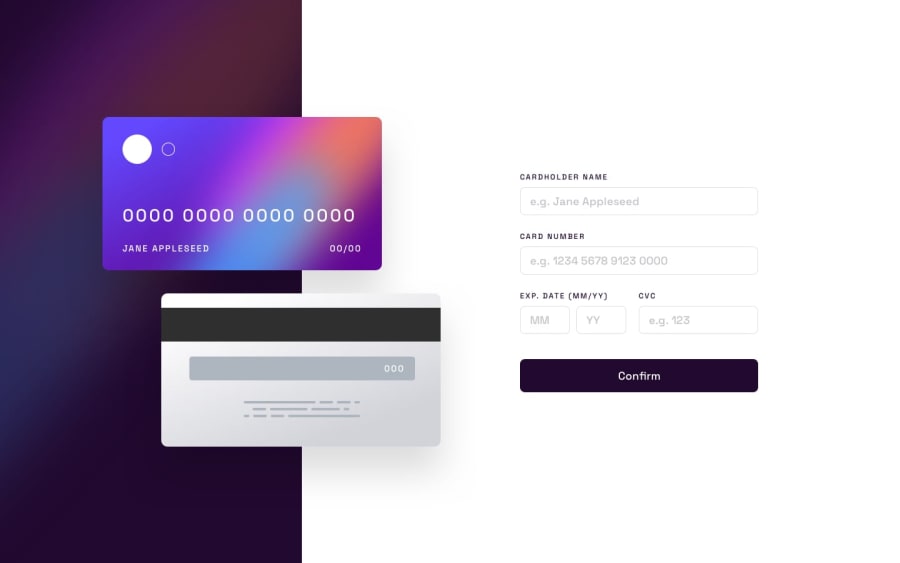
Design comparison
Solution retrospective
Probably I'm still a newbie but I've tried to made a "junior" challenge cause I feel that I need to improve my Javascript most. From the community I would like to know how I should use position absolute in a better way in order to be more responsive(if I could use different and most useful units etc.). About JavaScript of course I'd like to refactoring the code, I know that is confusing. I wasn't able to add a class on the input to show a red border. About CSS, I wasn't able to make a linear gradient border when on focus. All the feedback Are accepted and I will be grateful to everyone!
Community feedback
- @mark-gardner74Posted about 2 years ago
Hi,
This is very close to being spot on. I often find absolute positioning a little clumsy and not very responsive... but I still use it (I have been searching for an alternative). With this challenge, I set the width of the images (using rem as a unit) and placed them using the breakpoints to fix their position (absolute within the container). The contents such as names and numbers could then be placed in the knowledge that they wouldn't wrap or move around (using flexbox to space them nicely).
With regards to the JavaScript, if it works then all good. As you go along you will find your code improves and you develop a style. The important thing is to understand what you have written and equally as important is that when you pick it up 3 months later you still understand it. It is easy to be clever with code, sometimes too clever for your future self :-). Your code is solid, well-spaced and readable. I would look at whether a variable I refer to once needs to be a variable and not just use the ID. I would also look at some of the validations, note that these can be done in HTML with a CSS pseudo-class of :invalid / :valid to format things. Common pieces of code can be combined and variables passed in. Just look for repeating code, this will come with time.
On the whole, so close, good work and best of luck for more of these challenges.
Marked as helpful0@lmacandaPosted about 2 years ago@mark-gardner74 About JavaScript is exactly what I ask myself.. Will I remember why I'm doing this way? =P. Thanks a lot for the feedback, appreciated.
0 - @ghintemaPosted about 2 years ago
Hi Laura,
with respect to responsivnes I'd recommend you to give the credit card images (front and backside) a fixed(!) size so that the card-content (number and name) don't breake. If you do want to have it growing and shrinking, then try a min-width of 300px. Thats enough to prevent the number from breaking. Try to get the cards move to the left, if you run out of space on small desktops and/or reduce the whitespace between the form and the cards. In my own solution I gave the cards a position: absolute with left in %. The gap between form and left side also in %. You should better change to mobile-layout bevor you breake the card-number or get a vertical scrollbar or cover the form with the cards (wich may happen with a fixed card-size or min-width).
I hope I could have helped you a bit and wish you all the best for your further learning. Me too, I'm probably just a little beyond beginner level. Best regards from Bolivia, Harm
0@lmacandaPosted about 2 years ago@ghintema Thank you Harm! I'll try to do what you've suggested. Best regards from Portugal
0
Please log in to post a comment
Log in with GitHubJoin our Discord community
Join thousands of Frontend Mentor community members taking the challenges, sharing resources, helping each other, and chatting about all things front-end!
Join our Discord
