Design comparison
Solution retrospective
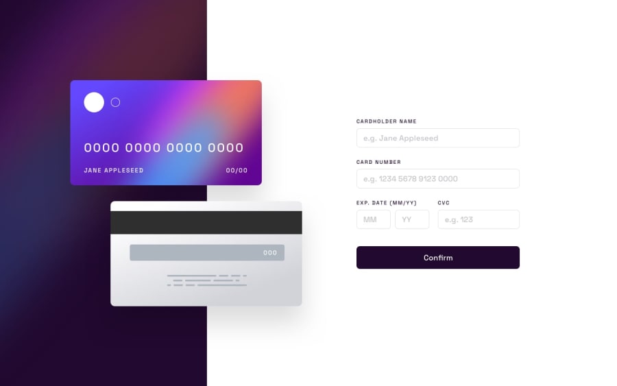
I'm most proud of how I implemented real-time updates for the card details based on user input, and how I ensured a responsive design that adapts well to different screen sizes. Next time, I would focus more on optimizing the form validation logic to handle edge cases more efficiently.
What challenges did you encounter, and how did you overcome them?I faced challenges in synchronizing the card number formatting as the user types, ensuring it matches the required format. I overcame this by using regular expressions and carefully managing state updates in React to reflect changes instantly without compromising performance.
What specific areas of your project would you like help with?I would appreciate feedback on improving the accessibility of the form elements, especially ensuring all interactive elements are fully usable for users with disabilities. Additionally, guidance on further enhancing the CSS transitions and animations for a smoother user experience would be valuable.
Community feedback
Please log in to post a comment
Log in with GitHubJoin our Discord community
Join thousands of Frontend Mentor community members taking the challenges, sharing resources, helping each other, and chatting about all things front-end!
Join our Discord
