Submitted almost 2 years ago
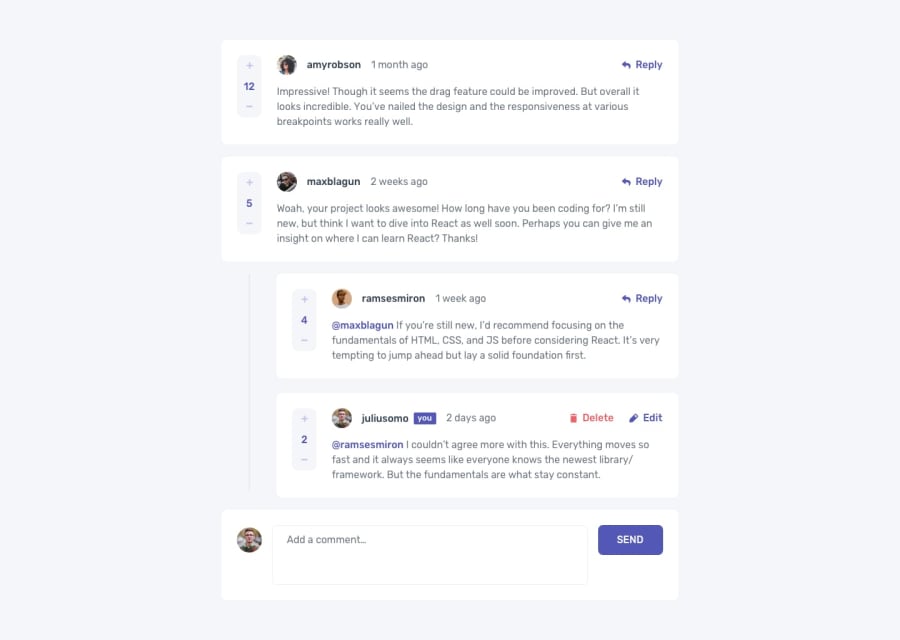
Responsive Interactive Comments Section App using NodeJS and MongoDB
@jcasare
Design comparison
SolutionDesign
Solution retrospective
I decided to add a little twist to it by placing the input section above instead of below...Also, I added a user authentication phase where user has to signup and login before accessing the app.
Community feedback
Please log in to post a comment
Log in with GitHubJoin our Discord community
Join thousands of Frontend Mentor community members taking the challenges, sharing resources, helping each other, and chatting about all things front-end!
Join our Discord
