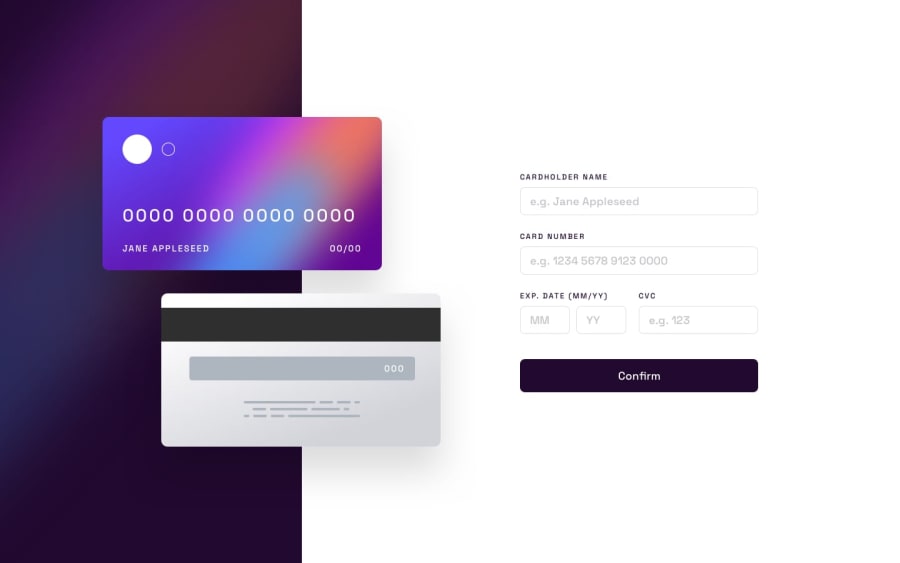
Design comparison
SolutionDesign
Solution retrospective
Hello everyone, I ran into issues with the form validation causing the lower form elements to move upwards to accommodate them.
Also with placing the text onto the card for desktop mode, it looks wonky at certain breakpoints.
Community feedback
Please log in to post a comment
Log in with GitHubJoin our Discord community
Join thousands of Frontend Mentor community members taking the challenges, sharing resources, helping each other, and chatting about all things front-end!
Join our Discord
