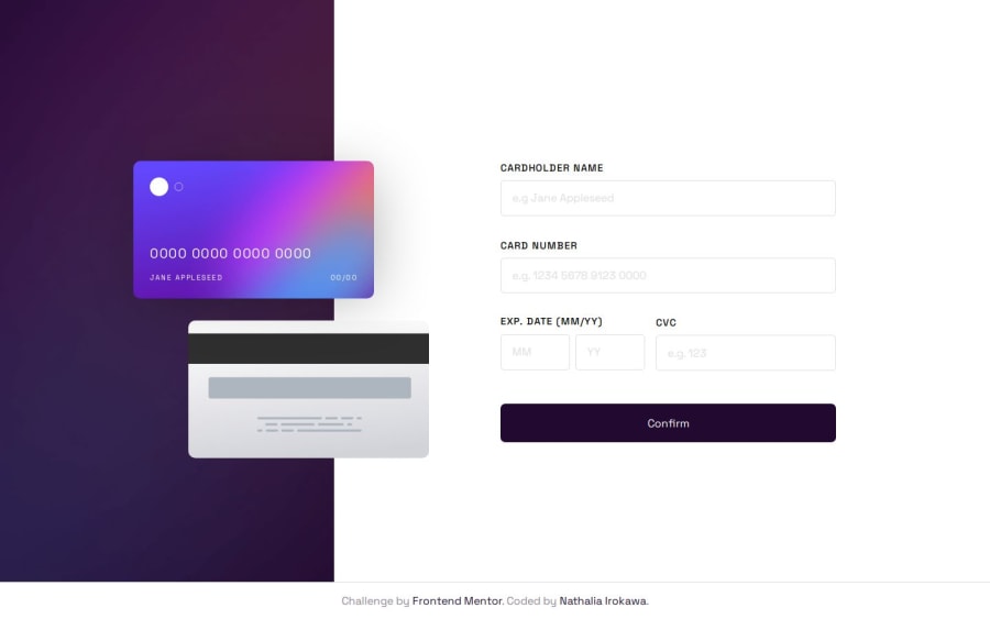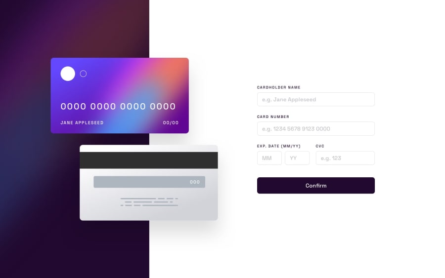
Design comparison
SolutionDesign
Solution retrospective
What are you most proud of, and what would you do differently next time?
Making the flip card was an idea I had ever since I saw the challenge, but was unsure wether I could make it work. Plus, I worried the second card would look too out of place, being simply part of the layout instead of something that's interactive. I might change the animation later, but for now I'm liking it the way it is.
What specific areas of your project would you like help with?Any feedback is appreciated.
Community feedback
Please log in to post a comment
Log in with GitHubJoin our Discord community
Join thousands of Frontend Mentor community members taking the challenges, sharing resources, helping each other, and chatting about all things front-end!
Join our Discord
