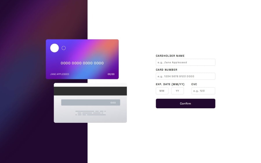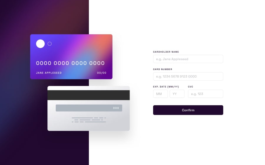
Design comparison
Solution retrospective
I have learned a lot about how to manage flexbox and grid, I think that despite being a junior, it has been very entertaining to get the vast majority to follow the same flow and design, although obviously, it is not perfect.
What challenges did you encounter, and how did you overcome them?Without a doubt, managing the inside of credit cards and being able to adjust them in position while maintaining their aspect ratio in the vast majority of resolutions.
In the end I managed to "solve" it by trying and making a lot of mistakes.
What specific areas of your project would you like help with?Especially in the CSS part since, in the end, it has been very difficult for me to move the cards to a position without breaking the form part in different resolutions.
Please log in to post a comment
Log in with GitHubCommunity feedback
- @brunomoleta
Hola Ruben,
I suggest some adjustments to your code. I've cloned it from Front End Mentor and made a PR at Github.
It involves retrieving the values from the form at the Card when the user refreshes the page and the overall architecture of the Javascript part of the project.
I also removed the placeholder from the inputs, as it's not a good design practice.
I know it was in the proposed design, but placeholders fool the user, as described by the UX designer Adam Silver.
Please check the commit history, as it might be easier for you to follow how I thought your project through.
Also, I removed the "required" you put on the inputs. The idea is to use a library such as Joi, Zod, or Yup to give the user a helpful message when they don't fill up the form as we expected.
(The red line below the form when trying to submit the wrong data).
The warning from HTML is far from ideal. I didn't do it here cause, to be honest, I don't know how to do it in VanillaJs, I've done it only at React.js.
The way you named your variables is very organized, so kudos on that. It's no small thing, for real.
Keep up the hustle, amigo :)
Saludos de Brasil
Marked as helpful
Join our Discord community
Join thousands of Frontend Mentor community members taking the challenges, sharing resources, helping each other, and chatting about all things front-end!
Join our Discord
