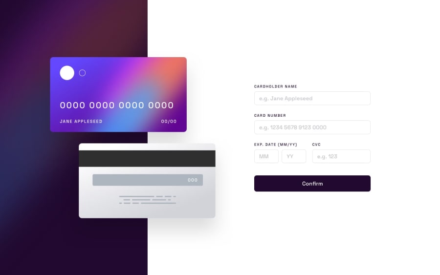
Design comparison
Solution retrospective
I would like to get feedback for validation form since my code is kinda sloppy. Any feedback regarding accessibility and responsiveness (especially for credit card divs) is also welcome.
Community feedback
- @jessegoodPosted about 2 years ago
Hi Kaan
Nice solution! Here is some feedback, I hope it helps:
-
It appears you did all the validation by yourself, but I would highly recommend looking into the validation API built-in to browsers. Basically let the browser do the checking for you! For example, to check for empty input, you can do something like the following:
- Add the
requiredattribute to your input like this: <input required ... > - In Javascript, you can check the input like this:
var validity = input.validity; if (validity.valueMissing) // Do something- I recommend reading this article about it. Let me know if you have any questions.
- Add the
-
Concerning responsiveness. I see a media query for
max-width: 372pxand then the next one ismin-width: 500pxso anything in between that is not accounted for. As a quick test, try resizing your browser and see how the layout changes. Also, I would recommend setting amin-widthon the cards so they do not become too small. -
Try setting the card number to all
1s like this: 1111 1111 1111 1111. You will see that the width is off. To fix this set the following css propertyfont-variant-numeric: tabular-nums;.
Marked as helpful1 -
Please log in to post a comment
Log in with GitHubJoin our Discord community
Join thousands of Frontend Mentor community members taking the challenges, sharing resources, helping each other, and chatting about all things front-end!
Join our Discord
