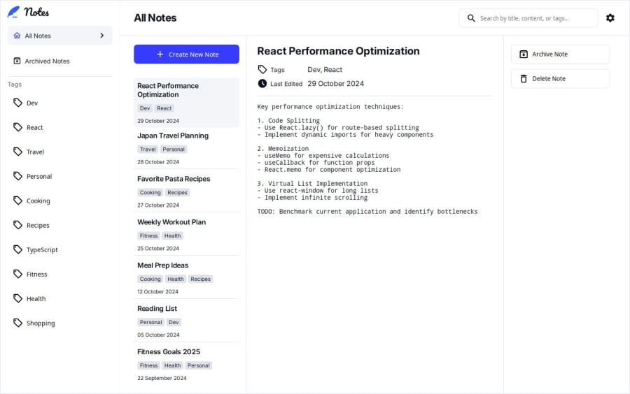
Responsive | Interactive | Animated Notes App


Design comparison

Solution retrospective
I am excited to have managed to tackle this challenge and implement all functionality, regardless of the difficulties I may have encountered during development.
I underestimated the complexity of this challenge, as I initially implemented the desktop version, which was surprisingly easy as I used conditional rendering instead of routing. The tablet and mobile versions were the tricky ones and posed a challenge that forced me to use react-router for routing, as I noticed conditional rendering would have created an unreadable code.
The current version is working as expected, and I look forward to hearing any feedback you might have on how I can improve my solution or anything I may have missed.
I am very happy with my decision to get the Premium subscription because not only do the designs provide a clear guide on potential components you could build for reusability, but you also get a prototype that makes everything clear regarding how the software you are building is intended to behave.
Happy coding
Community feedback
- @grace-snowPosted 3 months ago
This looks great but I spy some accessibility errors looking at the form code like
- unnecessary fieldsets with repeating legends/labels
- unlabelled inputs
- missing aria-live
- aria-desciribedby referencing Ids that aren't rendered and visible yet. (They should reference the elements wrapping the conditionally rendered error text, not the element that's being conditionally rendered)
- unnecessary aria-labels
I'd also want to test what happens for users with a larger text size setting in their browser or device as there are a lot of px units being used in this...
It seems like theres theming in there too but that's been done in quite a complex way. I'd expect to just update some custom properties at the root to update theme colours throughout. Worth exploring as a refinement.
Marked as helpful2@VictorKevzPosted 3 months ago@grace-snow As always much appreciate the feedback, let me refine the accessibility part, I also did notice errors and warnings thrown in when I inspect with the browser tools.
I have always been wondering about that part on styling themes because indeed conditionally applying styles seems tedious but I haven’t figured out a solution yet. Perhaps with tailwind I will be able to effortlessly achieve the same goal even though I somehow prefer writing my own css.
0@grace-snowPosted 3 months ago@VictorKevz You don't need to use tailwind. You're just not using css custom properties in a good way. Set up properties for each theme. Eg
--bg-body: #fffby default becomes--bg-body: #000in a.darkparent class or data- theme on the body. All the colours would auto update.1@VictorKevzPosted 3 months ago@grace-snow Oh my God! Yes, I just understood what you mean and tried it out, it's so much better and straightforward haha thank you so much for pointing that out. Something like this below
:root {
  --primary-color: #000000;
  --secondary-color: #ffffff;

  /* For cards */
  --card-bg: #f8f9fa;
  --card-border: #ddd;
}

/* Dark Mode Overrides */
.dark {
  --primary-color: #ffffff;
  --secondary-color: #1f1f1f;

  /* For cards */
  --card-bg: #2a2a2a;
  --card-border: #444;
}
1

Please log in to post a comment
Log in with GitHubJoin our Discord community
Join thousands of Frontend Mentor community members taking the challenges, sharing resources, helping each other, and chatting about all things front-end!
Join our Discord