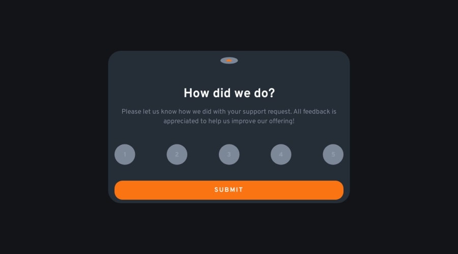
Design comparison
Solution retrospective
When I Hit the submit button there is a weird flicker how can I fix that? How is my component layout set up and how can it be improved? Why do the colors look different than the ones shown in the design? I used the same ones I Got from the styles guide document when I tried using a color picker to get the exact image it would just match the card background color
Community feedback
- @danielmrz-devPosted 12 months ago
Hello @MrNikaa!
I don't have answers for all of your questions, but I'll try my best here:
-
This project doesn't have a big difference between mobile and desktop versions, so it's not a problem using fixed values for the
width. Using percentage values can make your container overgrow as you expand the screen. -
The
background-colorin the card is not matching because in the original design its a gradient. You can create background gradients withbackground-image: linear-gradient(to top, color1, color2). That's an example. The gradient can go any direction (top, bottom, right, left) you like.
I know I didn't answer all the questions, but I really hope it's useful for you!
Marked as helpful1 -
Please log in to post a comment
Log in with GitHubJoin our Discord community
Join thousands of Frontend Mentor community members taking the challenges, sharing resources, helping each other, and chatting about all things front-end!
Join our Discord
