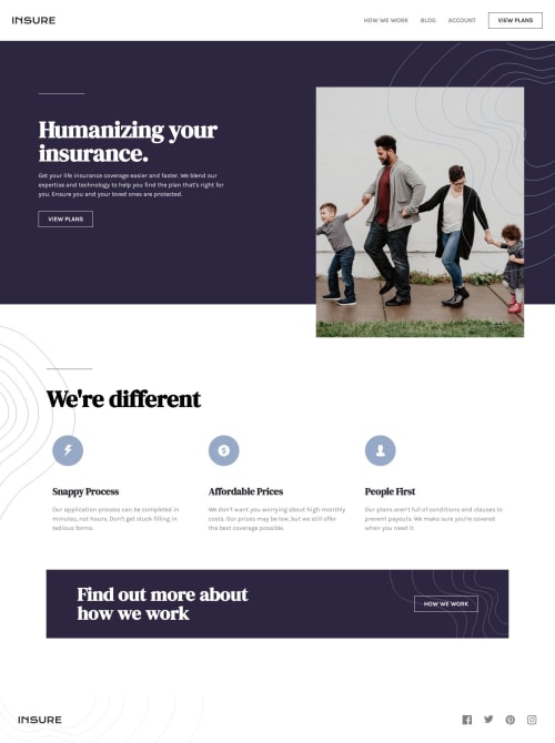
Responsive Insure Landing Page w/ Expandable Navigation[HTML,SCSS,JS]

Solution retrospective
Hi everyone! 👋
This is my solution to the Insure Landing Page Challenge. This took about a week to finish and deploy. I have used Semantic HTML, SCSS, CSS and Vanilla JS along with Vite to create this project.
I'm really proud of experimenting with the complex layout of the intro of this challenge. It was a combination of both grid and position properties. It took a little bit of time to create it but in the end, it look and worked as expected. I would try my best to make my websites better in accessibility the next time.
Creating the patterns was a little challenging at first. But, after thinking for a few minutes, I got the idea on how to create it.
Another challenge was creating the mobile navigation menu. I used a different approach to build it this time. I usually just tweak the default line of links to a vertical layout and hide it. But, it works so I'm happy!
What specific areas of your project would you like help with?Any suggestions are welcome!
Please log in to post a comment
Log in with GitHubCommunity feedback
No feedback yet. Be the first to give feedback on Tharun Raj's solution.
Join our Discord community
Join thousands of Frontend Mentor community members taking the challenges, sharing resources, helping each other, and chatting about all things front-end!
Join our Discord