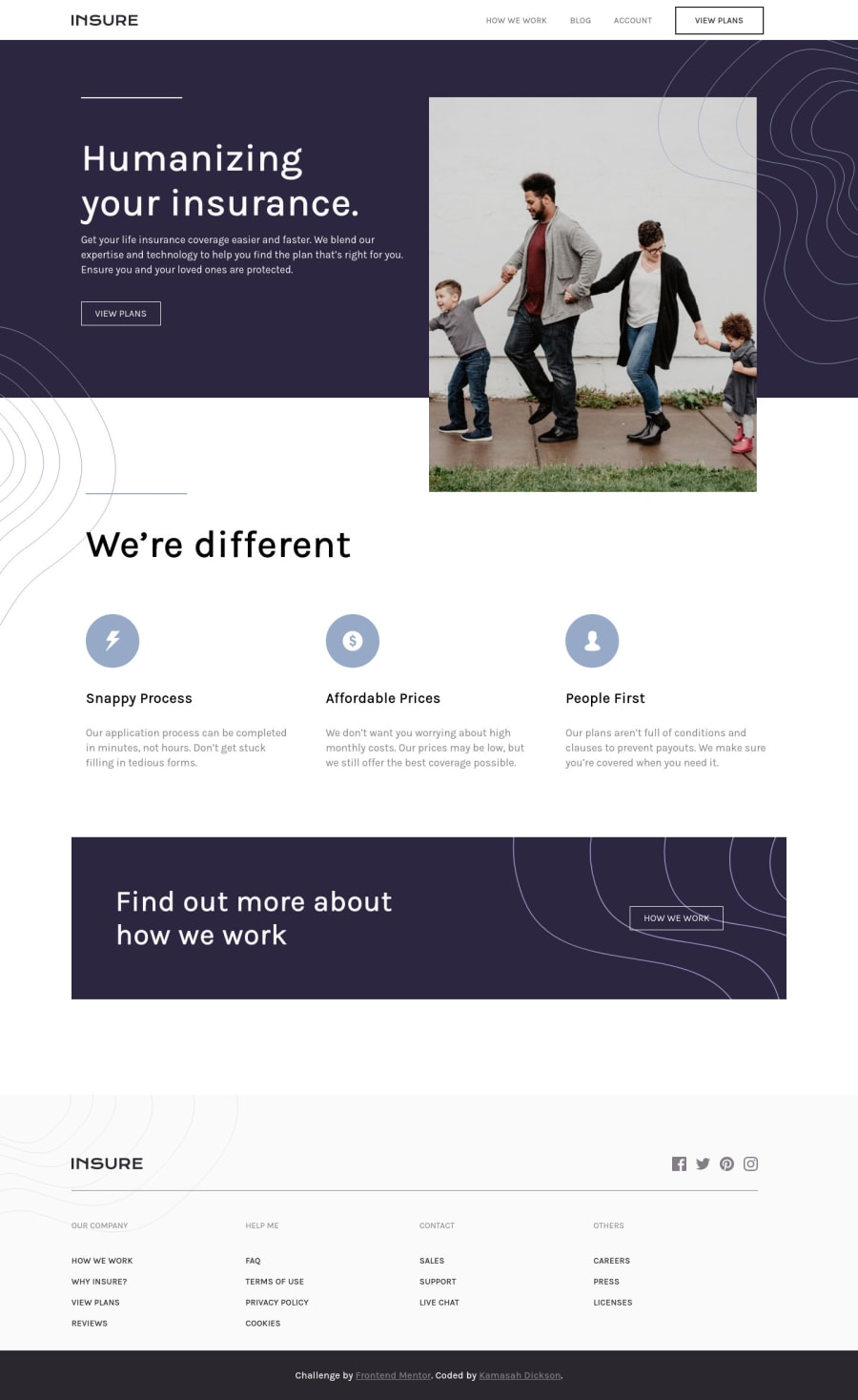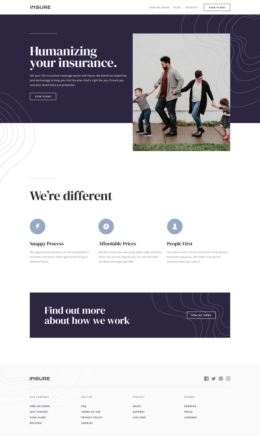
Responsive Insure Landing page made with CSS Grid and CSS Flexbox.
Design comparison
Solution retrospective
Hello frontendmentors. It has been a while now but am here with another solution, It may not be pixel perfect but what do you think about this solution. I really had a tough time with positioning the background svgs.
Community feedback
- @Cooly-o-CatsPosted almost 3 years ago
This solution looks great! Make sure to use the font provided in the design file to keep the site looking as close to the design as possible. Also, I noticed your spacing seems a little off especially at the "We're Different" section. Finally, make sure to put your HTML in either
<header>,<main>or<footer>tags. That will fix your accessibility issues.0@Kamasah-DicksonPosted almost 3 years ago@Cooly-o-Cats i appreciate your comment
0
Please log in to post a comment
Log in with GitHubJoin our Discord community
Join thousands of Frontend Mentor community members taking the challenges, sharing resources, helping each other, and chatting about all things front-end!
Join our Discord
