Design comparison
Solution retrospective
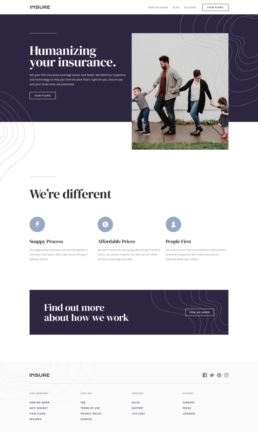
I would love feedback on the top portion of my solution (intro section), specifically around the background images and featured image placements. Any feedback on the code for this portion would be greatly appreciated.
Community feedback
- @dwhensonPosted about 3 years ago
Hey @SheGeeks nice work here!! 🙌
On the top section, I think your code is looking OK, not sure about that in-lined JS, but I'm not super strong on JS, so I'll leave that for now....
One thing I noticed is the padding on the nav bar seems to make it too narrow at some viewport sizes. In cases like this when you are addressing layout it's generally better to try and adjust the settings on the parent element and let the children inherit the styles - this is more flexible.
In this case, for example, I would suggest removing the
padding: 1.1rem 9.9rem;on thenavand then adding a "container" class with some inline padding to the parent element. You can then add this class to other elements on the page and it will help with aligning things.Also the page stretches very wide on large monitors and you might want to constrain this? There are many ways to do this but I set a grid on the body element, with three columns, as using a class selector as follows:
.center-content {
	display: grid;
	grid-template-columns: minmax(1rem, 1fr) minmax(375px, 1440px)minmax(1rem, 1fr);
}

.center-content > *  {
	grid-column: 2;
}
The 1440px is the max-width you want the main content to be, and the 1rem values is the smallest spacing you want either side of the main content on small screens (I sometimes put this to 0 and use a container to add padding to each section).
The second part positions all direct children of the body in this nicely sized middle column. In my case, mostly, my header, main, and footer the middle column, and stops them going wider than 1440px. It’s also pretty easy to ‘break’ elements out of this constraint if you need to.
Other people use container classes to do the same thing. This article has a good run down of alternative approaches https://css-tricks.com/the-inside-problem/ You will note I am actually using the approach the author doesn't like!
Either way it's a good idea to find an approach that works for you as you'll need this for a lot of FEM challenges. I have found that this approach combined with the use of a standard 'container' or 'wrapper' utility class that applies consistent padding through the document has really helped me a lot.
If I've explained anything poorly please just let me know and I'll try and clarify.
Hope this helps. Keep up the good work!! 👍
Cheers 👋
Dave
Marked as helpful3@SheGeeksPosted about 3 years ago@dwhenson Dave thanks for the in-depth response. I really appreciate you taking the time.
I will experiment with your suggestion on placing the padding on the parent instead of the child elements to see how that works.
As for containing the page, which is a great suggestion, I decided not to do that for this solution, though I have in others. I'm actually fine with the way it looks on wider displays and most common devices will not have displays that big. So I'm leaving that as-is on this one. I do appreciate the article you shared on this. It was a great read and a learned a few more patterns for this trick too. Thanks!
1
Please log in to post a comment
Log in with GitHubJoin our Discord community
Join thousands of Frontend Mentor community members taking the challenges, sharing resources, helping each other, and chatting about all things front-end!
Join our Discord
