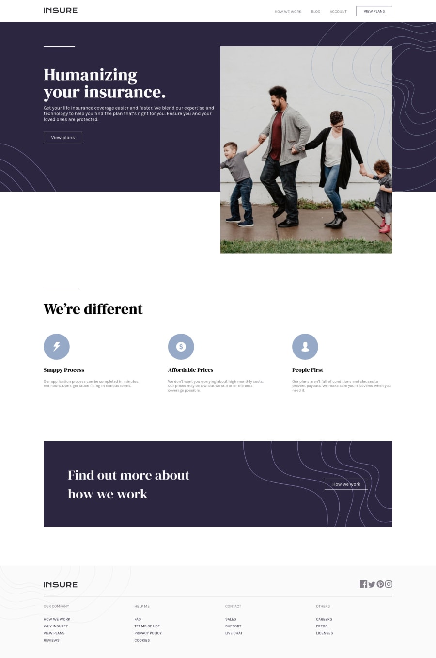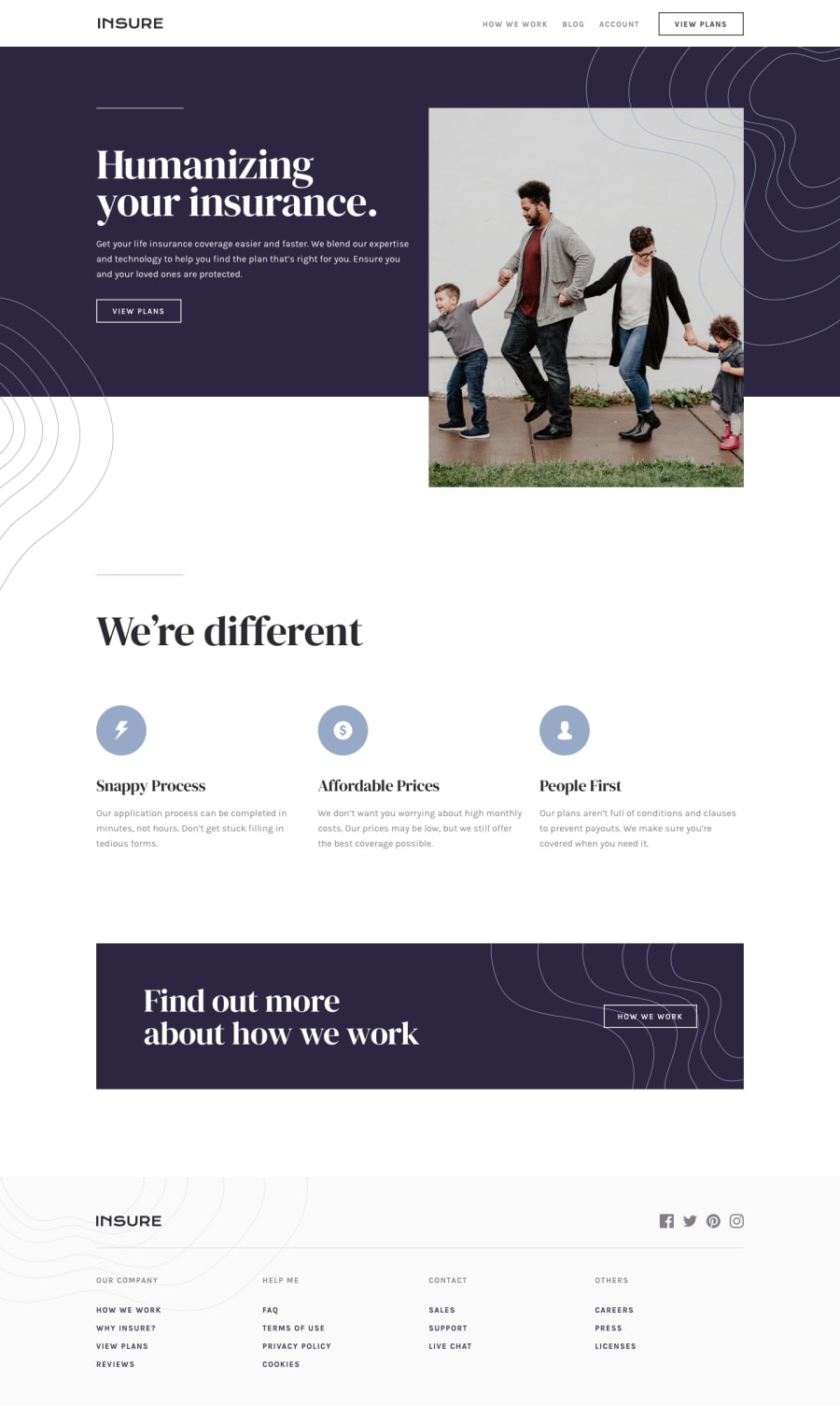
Design comparison
SolutionDesign
Solution retrospective
Though I was able to achieve the desired result, I'm not sure if I am following the best practices. Any help, criticism, or feedback is welcome, I am here to learn!
Community feedback
- P@SebastienpandaPosted over 2 years ago
Hello, first of all congratulations! I advise you to put your navBar in the header for semantics and screen readers is better. And for the rest it looks good to me! Continue like that !
0
Please log in to post a comment
Log in with GitHubJoin our Discord community
Join thousands of Frontend Mentor community members taking the challenges, sharing resources, helping each other, and chatting about all things front-end!
Join our Discord
