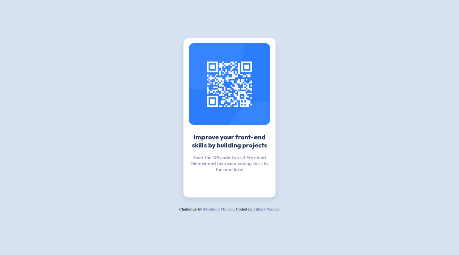
Design comparison
SolutionDesign
Community feedback
- @frank-itachiPosted over 1 year ago
Hello there 👋. Congratulation for completing the challenge👍!
I have some suggestions about your code that might interest you.
HTML 📄:
- Wrap the page's whole main content in the
<main>tag. - If your code has different sections that have a specific purpose like a navigation, article, sections or footer, it’s a good practice to enclose those parts with HTML5 landmarks. For example, you could use a
<footer>tag to wrap the<div class=”attribution”>section.
CSS 🎨:
- Avoid using absolute length units px, especially for font-size and width properties, because they are not relative to anything else so that means they will always be the same size. Instead, you can use relative lengths like em or rem. The benefit of that last one is element which has that unit will scale relatively to everything else within the page, e.g., the parent container. You can dig up about it here.
I hope you find it useful! 😄 Above all, you did a good job!
Happy
<coding />😎!0 - Wrap the page's whole main content in the
Please log in to post a comment
Log in with GitHubJoin our Discord community
Join thousands of Frontend Mentor community members taking the challenges, sharing resources, helping each other, and chatting about all things front-end!
Join our Discord
