Design comparison
Community feedback
- @grace-snowPosted almost 4 years ago
Hi there,
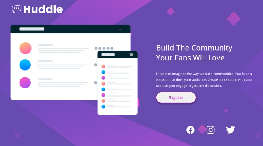
This looks great on my mobile, the only thing that's quite different to the design is the social icons.
Looking at the html, it looks like you're using background images for those. That's unusual for these things tbh, it's more common to have images in the html if it's content like this, but it's not 'wrong' or anything. Just make sure the links have aria-labels.
Looking at css, it could be a lot shorter. Because you've used a lot of widths I think and because you've gone desktop first, that's making the css unnecessarily complicated. I wouldn't expect there to be more than one media query for a challenge like this to be honest. I recommend on your next challenge you try mobile first and see if that makes a difference. If you find yourself wanting to add more than 1-2 min-width media queries, that will be a sign to you there's probably a better way to acheive your layout.
Best of luck with it
1 - @VbanetyPosted almost 4 years ago
Thanks for all the tips you gave me Grace, I'll follow it, and start for mobile first in the next challenge. Grateful :D
0
Please log in to post a comment
Log in with GitHubJoin our Discord community
Join thousands of Frontend Mentor community members taking the challenges, sharing resources, helping each other, and chatting about all things front-end!
Join our Discord
