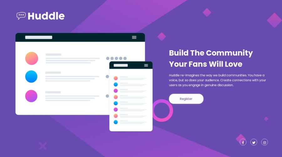
Responsive huddle register landing page


Design comparison

Solution retrospective
Use SCSS, I hope to understand it more. Find a new way for width in media queries instead of writing min-width and max-width every single time by using (minValueWidth
Community feedback
- @grace-snowPosted 6 months ago
Hi I don't think this is finished yet. Mobile styles should be the default styles but this is trying to show the desktop layout on mobile at the moment.
Also, I note you've tried to make this accessible but think you're misunderstanding what aria-label should say. It's providing the accessible name of the link so must say the destination. For example, the logo link goes to the homepage so should be "Huddle - Home" and the social links should only say the name of the social platform or name plus account like "Facebook" or "Facebook - Huddle". They shouldn't include the word "icon".
I hope that's helpful and clear.
1@rahafszPosted 6 months ago@grace-snow Thank you, I will fix aria-label. Why I should start with mobile? and if i start mobile thats mean the layout of it show on the desktop at the moment?
0@grace-snowPosted 6 months ago@Rahaf-Zourob we style mobile first for lots of reasons. The mobile view is always the simplest design so when you build for mobile that design will work on all screen sizes so it is a very good base to have. It will lead to shorter CSS overall because there is less to override -- you only have to make a few changes to make things work on the larger screens inside a media query. It’s also better for performance or the styles don’t have to get over written and changed for the smaller lower end devices.
I’m not sure what you’re asking about what would show on desktop? you would change the layout for larger screens in a min width media query.
even if you decide in this case to work desktop first, There are no mobile styles being applied at the moment and that needs to be fixed. I am seeing the desktop design trying to be squeezed into my little mobile screen which looks really broken.
In future projects, even if you don’t change this one, you really must start to work Mobile first
0@rahafszPosted 6 months ago@grace-snow Yes, I understood. That's happening because I made the min-width of the mobile 375px so smaller sizes were not taken into consideration, and desktop style was applied on them. The next time, I will start the mobile first and I will edit the width media query for mobile.
1

Please log in to post a comment
Log in with GitHub
Join our Discord community
Join thousands of Frontend Mentor community members taking the challenges, sharing resources, helping each other, and chatting about all things front-end!
Join our Discord