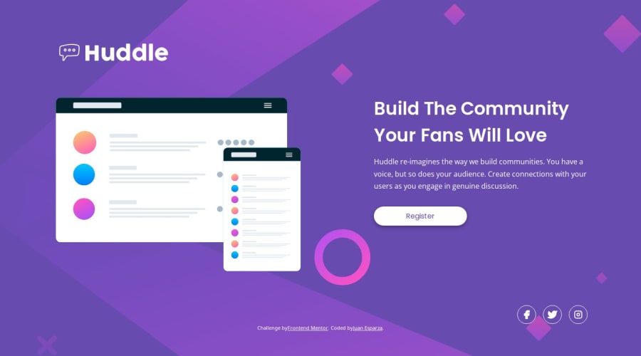


Design comparison

Solution retrospective
I think that i got pretty close to the design and I'm proud about that
What challenges did you encounter, and how did you overcome them?The footer, it looks well in some screen sizes and in larger ones just grows a lot. I will work in writting better html and css too.
What specific areas of your project would you like help with?Any feedback is appreciated. And any tip to how to fix the footer will be welcome as well. Thanks for your time :D
Community feedback
- @krushnasinnarkarPosted 9 months ago
Hi @JEWebDev,
Congratulations on successfully completing the challenge!
Your solution looks nice, though there are a couple of things you can improve which I hope will be helpful!
Issue: Website Stretched on Large Screens
Your whole website gets stretched for large screen sizes, not just the footer, but other components as well. They appear left-aligned and don't feel normal because of the lack of a maximum width. This issue arises because you didn't set a
max-widthfor your website's container.Solution: Use a Wrapper with
max-widthTo solve this, wrap all your components (header, main, footer, .attribution) inside a
divand give it a maximum width using themax-widthproperty. This will ensure that your content remains centered and doesn't stretch awkwardly on larger screens.Here's an example of how you can do it:
<div class="container">
  <header>
    <!-- Your header content -->
  </header>
  <main>
    <!-- Your main content -->
  </main>
  <footer>
    <!-- Your footer content -->
  </footer>
  <a class="attribution">
    <!-- Your attribution content -->
  </a>
</div>
And in your CSS:
.container {
  max-width: 1200px; /* or any width that suits your design */
  margin: 0 auto;
  padding: 0 20px; /* optional padding for better spacing */
}
I hope you find this helpful, and I would greatly appreciate it if you could mark my comment as helpful if it was.Feel free to reach out if you have more questions or need further assistance.
Happy coding!
Marked as helpful0

Please log in to post a comment
Log in with GitHub
Join our Discord community
Join thousands of Frontend Mentor community members taking the challenges, sharing resources, helping each other, and chatting about all things front-end!
Join our Discord