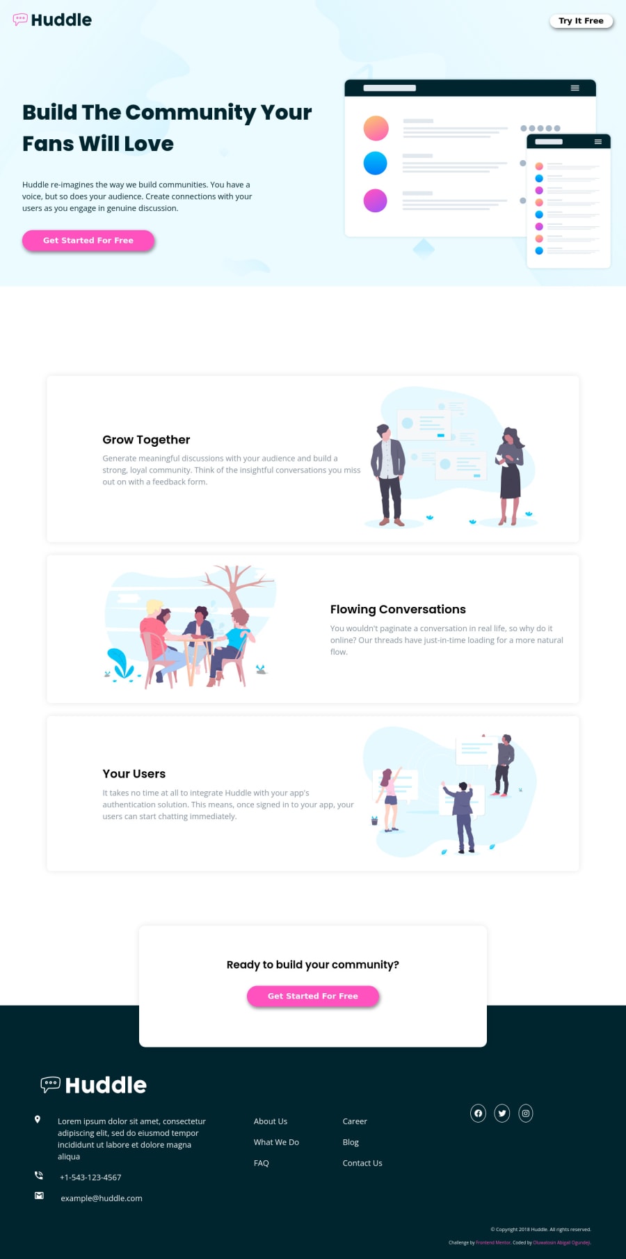
Responsive Huddle Landing Page with Alternating Feature HTML and CSS
Design comparison
Solution retrospective
I am excited about this project!
I was able to read up on the suggestions given by @laceeder and @didyouseekyng on naming convention. In a way, I tried implementing them. Kindly look through the code and tell me what you think.
Community feedback
- @didyouseekyngPosted over 2 years ago
Good evening Tee, I see you've done a great job here, the design is really great I have to be very honest with you, I can imagine how long you had to stare at your screen trying to complete this challenge. I see you looked up the BEM naming convention and trust me it made your class naming much much better than it used to be. I see you still had some accessibility issues again, believe me you'll get over it soon with more research. I'm currently working on a challenge now where I had to work with icons that are clickable, and using the Accessibility inspector with my Firefox developer tools, I encountered this "Links having discernible text" issue, so I used
aria-label="Link to my (social media name)"to actually add a descriptive text to the links containing the icons and it actually solved that problem for me. You can check more on that.Marked as helpful0@Heph-zibahPosted over 2 years ago@didyouseekyng I actually leaped for here with this commendation. Thank you so much.
Alright. I will add it to my next project
0
Please log in to post a comment
Log in with GitHubJoin our Discord community
Join thousands of Frontend Mentor community members taking the challenges, sharing resources, helping each other, and chatting about all things front-end!
Join our Discord
