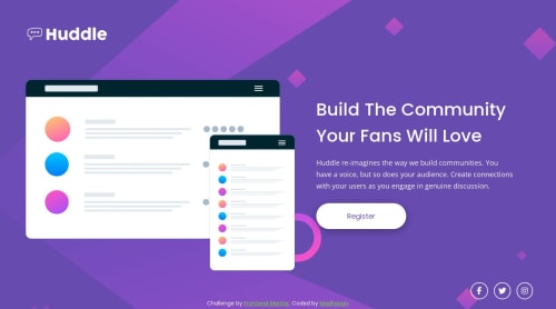
Responsive huddle landing page with a single introductory section
Design comparison
Solution retrospective
I have completed this as my 10th challenge in Frontend Mentors. I am glad to accept any feedback and suggestions regarding the accessibility and the techniques that I have used to develop the webpage.
Community feedback
- @MelvinAguilarPosted 11 months ago
Hello there ๐. Good job on completing the challenge !
I have some suggestions about your code that might interest you.
- For the company logo you should use the company name as the
alt
attribute value. The word "logo" is not necessary, The screen reader users will hear "Link, Graphic, Hubblw" and they will understand that the image is a logo.
-
Social media icons, which are often used to link to a company's social media profiles, should typically be anchor elements because anchor elements allows users to easily click on the icon and be taken directly to the company's social media profile page. This makes it easy for users to connect with the company on social media
Additionally, you should use the
aria-label
attribute to describe the links if they don't have visible text, this will help screen reader users to understand the purpose of the link.
e.g.
<a href="#" aria-label="Facebook"><i class="fa-brands fa-facebook-f" aria-hidden="true"></i></a>
- You should use the
cursor: pointer
property to indicate that the element like a button or a link is clickable.
I hope you find it useful! ๐ Above all, the solution you submitted is great!
Happy coding!
0 - For the company logo you should use the company name as the
Please log in to post a comment
Log in with GitHubJoin our Discord community
Join thousands of Frontend Mentor community members taking the challenges, sharing resources, helping each other, and chatting about all things front-end!
Join our Discord