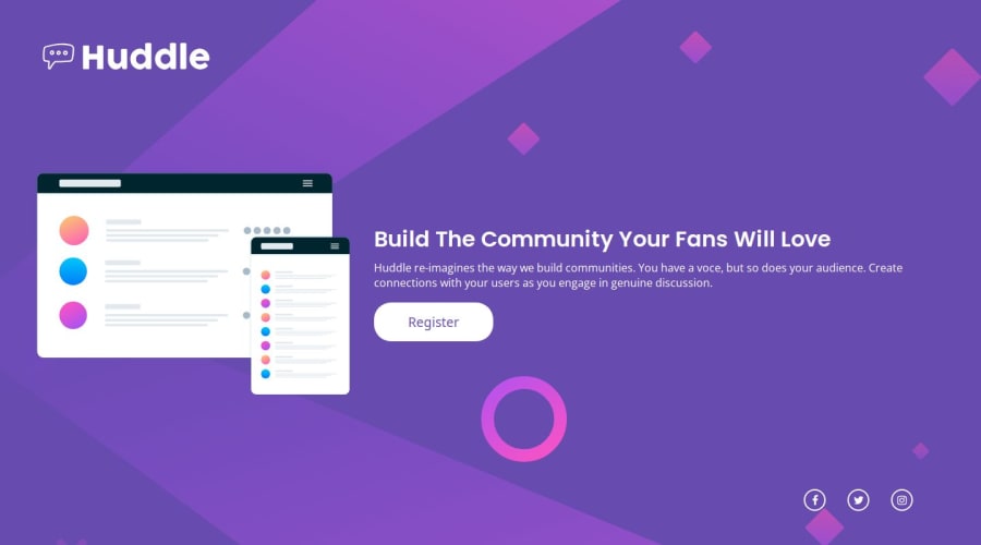
Design comparison
SolutionDesign
Solution retrospective
What challenges did you encounter, and how did you overcome them?
I faced challenges getting everything aligned but adding display flex to the body fixed it. I'm still struggling to fully understand the parent-child relationship and how they affect each other but slowly improving it.
What specific areas of your project would you like help with?In the following image you can see what the webpage looks like when viewed from my friends iPhone 14 on Safari iOS. This is not what it looks like on PC nor what it looks like on a samsung Galaxy S10, nor on an iPhone 13. Any help to fix this would be appreciated.
https://imgur.com/a/MqzFr0i
Image below is what it looks like on most other devices.
https://imgur.com/a/x8AiW7G
Community feedback
Please log in to post a comment
Log in with GitHubJoin our Discord community
Join thousands of Frontend Mentor community members taking the challenges, sharing resources, helping each other, and chatting about all things front-end!
Join our Discord
