Submitted over 3 years ago
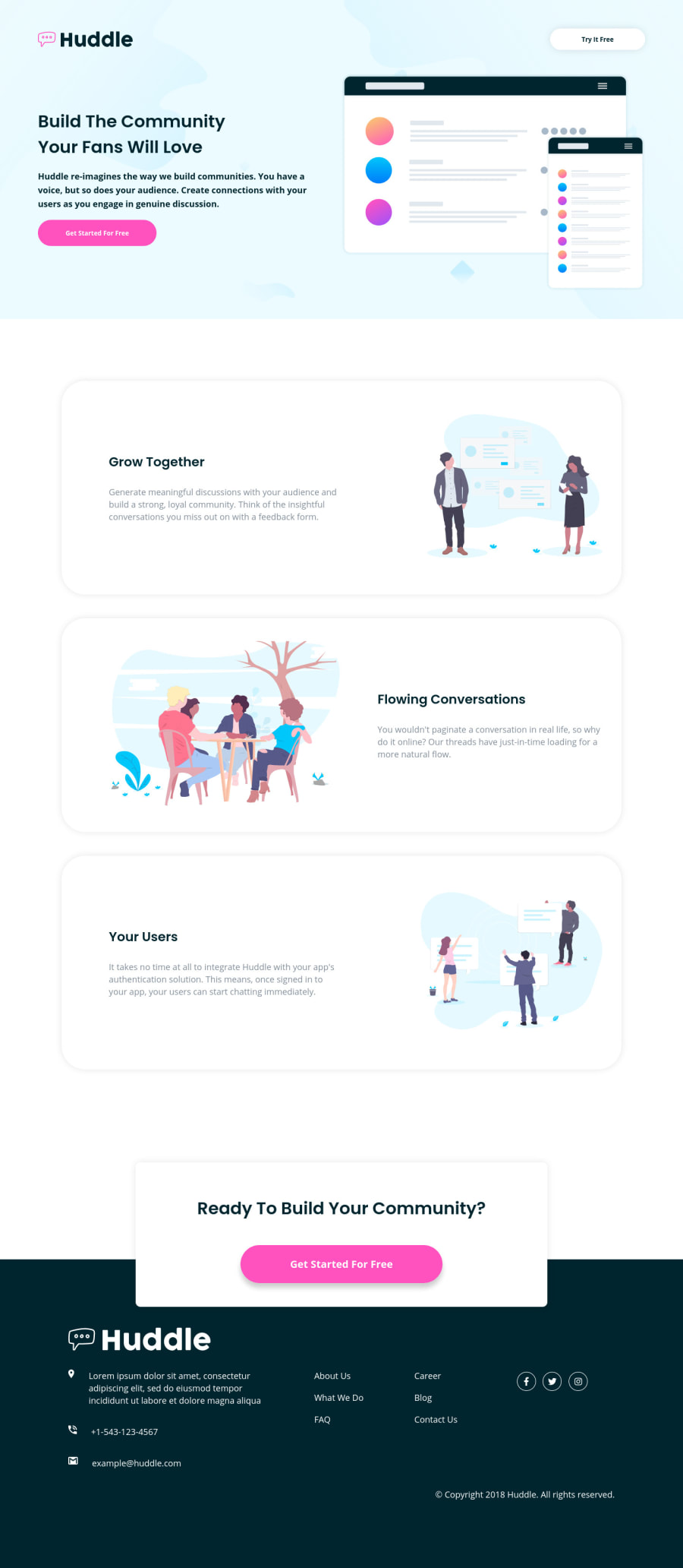
Responsive Huddle landing page using HTML, CSS Grid and Flexbox
@Ryusuke66
Design comparison
SolutionDesign
Solution retrospective
Any feedback is appreciated
Community feedback
- @afrusselPosted over 3 years ago
Nice work. For font size you may use rem value instead of px
2 - @ChamuMutezvaPosted over 3 years ago
altvalues likehuddle logoare not very informative to assistive technology users , the user must be able to visualise the message that is being put across. For decorative images usealt="". See the following article on writing good alt text- in the footer section, the anchor elements can be nested in an unordered list to assist with accessibility. Screen readers will announce the length of the list and the current position when tabbing, such information is very important.
- nice responsive site , well done
1
Please log in to post a comment
Log in with GitHubJoin our Discord community
Join thousands of Frontend Mentor community members taking the challenges, sharing resources, helping each other, and chatting about all things front-end!
Join our Discord
