Submitted almost 5 years ago
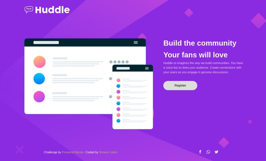
Responsive Huddle landing page using CSS3, Flexbox 🔥 and BEM
@simeon4real
Design comparison
SolutionDesign
Solution retrospective
Any feedback on how to improve my coding style would be highly appreciated. I didn't use Sass for this solution though.
Community feedback
- @mattstuddertPosted almost 5 years ago
Hey Simeon, sorry for my delay in looking at this! You've done a really good job. Overall your HTML structure is great. I'd just recommend a few changes on the accessibility side:
- Your
alttext for the logoimgsays "the logo". This doesn't actually give any context as to what the image really is. If it's a company logo, I'd recommend just putting the company name as the alt text. So it would just say "Huddle". - The same goes for your
alttext for the illustration of the mockups where you've currently got the text "huddle photo". I'd go for something more descriptive like "Illustration of a platform dashboard on desktop and mobile screens". When writing alt text, put yourself in the position of someone who cannot see the image themselves and then ask yourself if the text you've written actually represents the image. - You've added
aria-label="Register Button"to thebuttonelement that has the text of "Register" inside it. In this instance, thearia-labelisn't needed as the screen reader would read out that the element is abuttonand the content is "Register" by default.
Let me know if you have any questions. Keep up the great work!
1 - Your
- @simeon4realPosted almost 5 years ago
Thanks a lot @mattstuddert . I appreciate your feedback on my solution. I've learn a thing or two from your response. I do appreciate. Thank you
0
Please log in to post a comment
Log in with GitHubJoin our Discord community
Join thousands of Frontend Mentor community members taking the challenges, sharing resources, helping each other, and chatting about all things front-end!
Join our Discord
