Submitted about 2 years ago
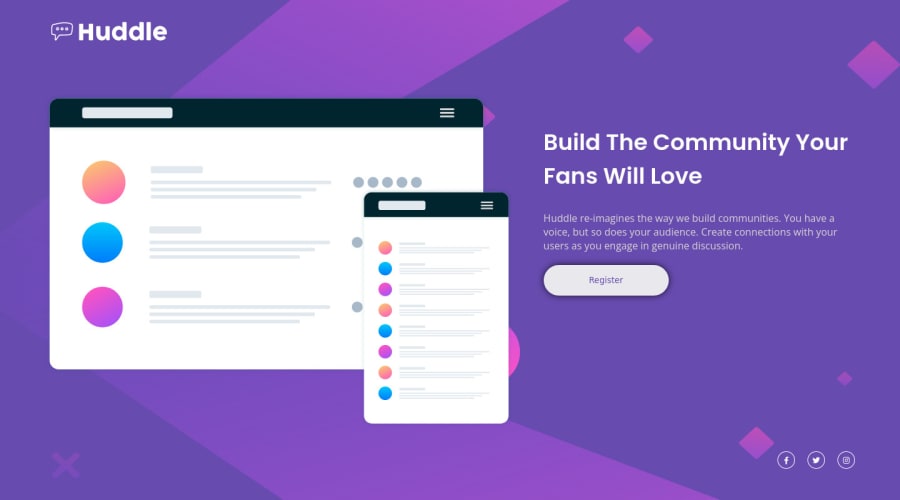
Responsive huddle landing page using css flexbox and grid
@Mahendran-C
Design comparison
SolutionDesign
Solution retrospective
Please give me any feedback how i can improve my skills
Community feedback
- @AdrianoEscarabotePosted about 2 years ago
Hi Mahendran-C, how are you?
I really liked the result of your project, but I have some tips that I think you will enjoy:
- To improve the accessibility of the project you could have put an h1. Every page must contain a level 1 header, for people who use screen readers, identity what the main title is.
Prefer to use
rem
overpx
to have your page working better across browsers and resizing the elements properlyThe rest is great!
I hope it helps... 👍
Marked as helpful1
Please log in to post a comment
Log in with GitHubJoin our Discord community
Join thousands of Frontend Mentor community members taking the challenges, sharing resources, helping each other, and chatting about all things front-end!
Join our Discord