Submitted about 2 years ago
Responsive huddle landing page (seeking help)
@ThePartnerDeveloper
Design comparison
SolutionDesign
Solution retrospective
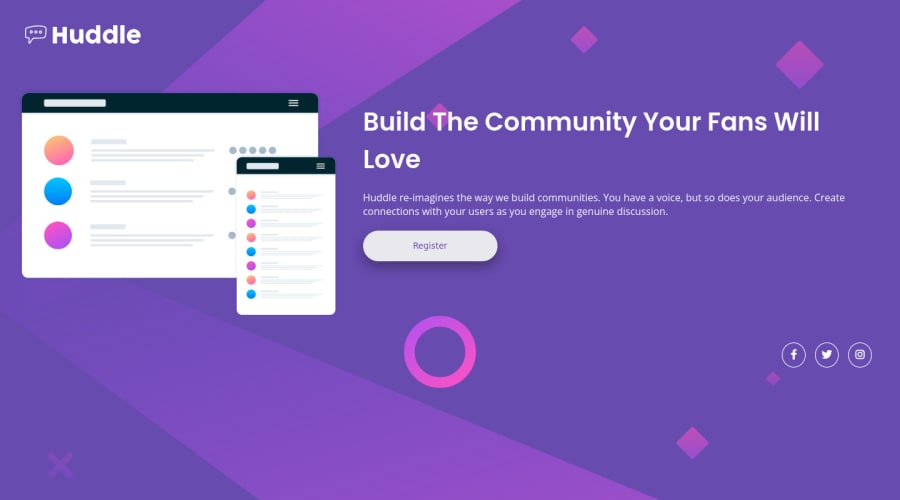
I need some input on what I could improve. I had trouble implementing the social media icons for the footer, along with the REM and EM units for font size, margins, and padding.
What questions I have
- Did I use REM and EM right? I mixed the sizing with pixels too so I might have messed that up.
- Did I correctly set up alt tags for the social media icon SVGs? I don't know how to set up the text that screen readers will play for SVGs that are loaded inline.
- How could I better set up the transitions for the buttons? I wanted a fade in and out for the pink color for all the buttons, but the fade out I had to get rid of because the transition on the class would load when website is loading and when you stop hovering over the button.
Community feedback
- @ThePartnerDeveloperPosted about 2 years ago
This is my first project trying to use the REM and EM units. I have also never tried the mobile-first approach for websites until this project. It seems I rushed both trying to learn both on this small project, which I should've split them up because I don't really understand either concepts apparently or how to implement into my web dev.
0
Please log in to post a comment
Log in with GitHubJoin our Discord community
Join thousands of Frontend Mentor community members taking the challenges, sharing resources, helping each other, and chatting about all things front-end!
Join our Discord
