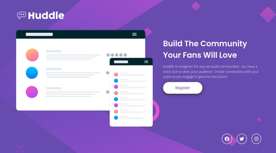
Design comparison
Solution retrospective
I would really appreciate feedbacks about this project, and I can tell in advance that I would never think I would take around 5 hours to finish this one, even tho it looks simple. One thing that I realize doing this huddle landing page is that I want to be 100% accurate with the design, even how the background is positioned, but I really struggle trying to make the background the same as the design, and in the final I couldn`t. I'm still happy because I didn't use the figma files, only the starter. I will keep working hard because I know me and you guys can make everything better! π«Άπ»
Community feedback
- @elaineleungPosted about 2 years ago
Hi Luis, great job working on this challenge, and I think everything looks great here, especially in getting your solution to look really close to the design! The responsiveness works well where the page has optimal views when the browser size is changed, and I don't see any major issues really. The only thing is, with the
height: 100vh
on the hero container, if you resize your browser so that the height is smaller than the contents, the contents will be cut off and cannot be scrollable upwards. You can try this out and see what I mean. To fix this, I would remove the height there and put amin-height
instead with a flexbox, and then in the.container
, I'd addflex:1
so that things could stretch out. Everything looks like this:.hero { min-height: 100vh; display: flex; flex-direction: column; justify-content: flex-start; } .container { flex: 1 }
Also, do be sure to check out the accessibility issues in your report and see how to fix them. Great work here again, and keep going!
Marked as helpful0@lhpellizzonPosted about 2 years ago@elaineleung You are a start!!! Any advice how to set the background image to be like the design? I`m really annoyed by this because the design cover the circle of the background on the middle. I really trying to avoid looking into yours one that I saw it is 100% like the original design haha. I will fix all the issues right now and update <3
0@elaineleungPosted about 2 years ago@lhpellizzon Hi Luis, I know what you mean about the circle! What I did for the background was, I started it as the mobile version with
background-size: contain
, and then changed that tobackground-size: cover
at the 800px breakpoint. Since it's an SVG, I just kept the mobile version up until the 1440px, which was when I changed it to the desktop version withbackground-size: contain
. It took me a while to figure out too, but I liked how I turned out!0
Please log in to post a comment
Log in with GitHubJoin our Discord community
Join thousands of Frontend Mentor community members taking the challenges, sharing resources, helping each other, and chatting about all things front-end!
Join our Discord