Submitted 10 months ago
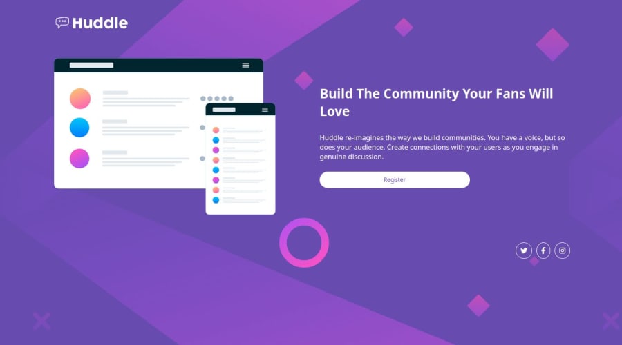
Responsive Huddle Landing Page
#pure-css
@abdul-busybrain
Design comparison
SolutionDesign
Solution retrospective
What are you most proud of, and what would you do differently next time?
Using Relative width, Avoid using absolute width.
What challenges did you encounter, and how did you overcome them?I faced challenges during the break-point when I'm trying to center the paragraph, i have to remove fixed width from it
What specific areas of your project would you like help with?Typography, Grid, Flex, responsive layouts
Community feedback
Please log in to post a comment
Log in with GitHubJoin our Discord community
Join thousands of Frontend Mentor community members taking the challenges, sharing resources, helping each other, and chatting about all things front-end!
Join our Discord
